

Has anyone ever encountered this situation: you have a pile of data and don't know how to present it?
After finally finding a template that looks good, you fill in the data and it seems to work, but the charts and layout don't fit the real data and business scenarios at all, making it hard to highlight the core value of the business.
Use AI, right? Making charts is faster, but what's generated is a static image that can't be edited, and the data logic may not even be correct.
Recently, a friend at a big tech company recommended an AI chart agent to me, Aichart. AI first understands the data, then generates visualization charts, and all the data and layouts can be deeply edited. It's amazing!
I threw all the data I use in my daily work into it and tested it, and dynamic charts, maps, word clouds, Sankey diagrams, and data dashboards were all no problem.
The key is, I found that Aichart can not only process data, but if we directly upload documents,Aichartit can also help us extract key information and organize it into a PPT suitable for reporting, making the key points of a work report clear at once!
01. Using AI for information interpretation
We open the Aichart homepage.

Official website:aitubiao.com
Automatically match suitable charts
I first uploaded a very messy set of data. This is a set of air quality monitoring data from different regions, with many fields, mixed data dimensions, and incomplete content, including quite a few empty values.
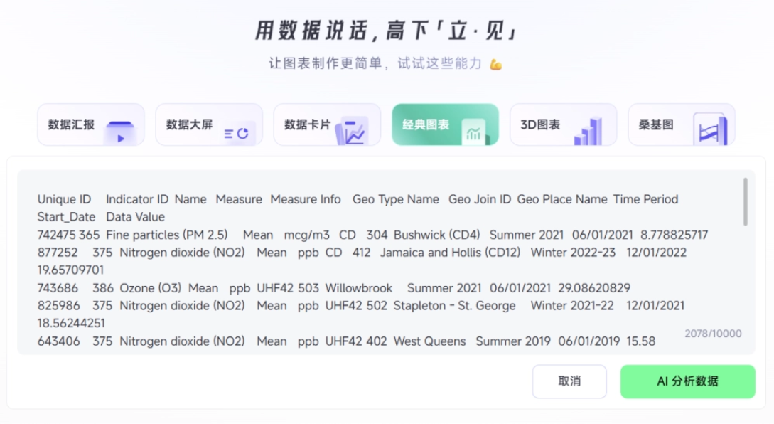
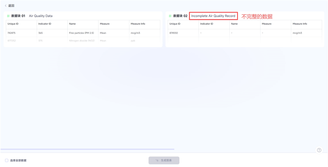
After throwing the data to Aichart, Aichart instantly completed the preliminary organization, directly splitting the data into 2 groups: one group is normal data with a complete structure, and the other group is incomplete data with missing items.
After we select the data table, we can convert it into various styles of charts with one click. During this process, we don't need to perform any operations. Aichart will automatically analyze the data structure, then automatically match the most suitable chart type to display the data based on field relationships and presentation goals.
This set of air quality monitoring data has many dimensions, so Aichart directly generated bar charts, line charts, and treemaps.
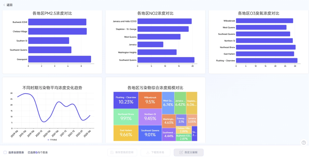
The color scheme, information hierarchy, and visual style are highly unified. It's obvious that it isn't simply fitting data into a template; essentially, it is driven by data understanding.
The final effect is very professional and clear. The overall trend of the data, the distribution, and the differences between different indicators can basically be understood at a glance.
Generated charts are editable
Anyone who has used other AI drawing tools knows that charts generated by AI are usually a PNG image. If some data in it needs slight adjustment, or the color doesn't match the brand VI, we can only start over, which is simply a nightmare for AI collaboration.
In Aichart, all charts generated by AI can be deeply edited!
In the sidebar where the chart is generated, we can input instructions to have AI modify the chart, just like chatting with a person. Color,title, background, font... almost all elements of the chart can be modified with one sentence。

For example, the treemap we just generated looks a bit gaudy in color.
We enter on the right: change to a blue-green color scheme. Aichart immediately understands and modifies it。
Even better, if we suddenly need to modify some data, we don't need to have AI run it again.We can directly modify individual data in the table, or directly upload a new table to overwrite it, and the chart will update dynamically instantly。
After the update, the overall chart style can still remain consistent, and the original visual style will not be disrupted. The whole process is both flexible and time-saving.
AI Data Analysis
Once the chart is made, how to present it during a report is also a big challenge. You don't know what to say, nor from which angles to approach it. If you just mechanically read the data, it is hard to highlight the problems, trends, and value reflected by the data, let alone propose optimization plans. No matter how good the chart is, it's useless without core value.
On this point, Aichart gave me another surprise! After generating the table, we can click to continue and let AI analyze the data, and the system immediately extracts several core conclusions based on the data distribution and trends of this set of charts. It helps us instantly grasp the key points most worth discussing during a report.
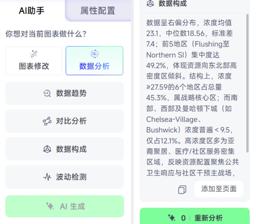
Moreover, the expressions and wording it provides are very professional. We can directly copy these conclusions into the content of the PPT, then add our own judgment, business context, and optimization plans, and soon put together a more insightful professional report.
This is also where AI truly empowers us. It not only saves us a little time making charts, but also lets us focus our energy on more valuable judgment, insight, and expression.
One-click generation of a data dashboard
Aichart supports one-click mode switching according to different usage scenarios。
Daily reporting data best reflects work performance. We can choose the data dashboard mode and send Aichart the messy data from daily account operations, such as follower count, views, likes, favorites, and so on.
In just a few minutes, Aichart generates a data dashboard with a reasonable layout, excellent color scheme, and support for multi-table linkage!
During meetings, we can let everyone intuitively and accurately understand what was done well and what was lacking in the work.
Changes in readership, changes in followers, and so on are all displayed in separate sections, very clearly.
Moreover, different section layouts can be directly modified by dragging and dropping, and the overall color scheme can be changed with one sentence.
Upload a new set of data, and Aichart will dynamically update it into a new table in real time.
In addition, we can also turn the data into lightweightdata cardssuitable for circulation in communities, or advancedSankey diagrams, satisfying all kinds of tricky business scenarios.
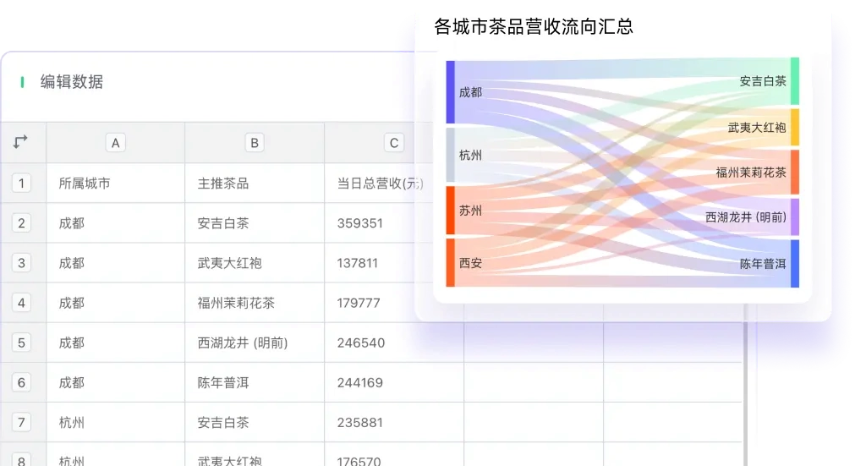
Professional Data Processing
Many people do not dare to use AI to write reports, precisely because they are afraid that AI will make up data (hallucinations). Even a small data error may lead to completely different conclusions, and the loss outweighs the gain.
Aichart adopts an independent AI processing mechanism and has built-in data structure recognition and verification capabilities, automatically avoiding common errors and logical conflicts, ensuring 100% rigor and accuracy in business reports.
02. Seamlessly integrate into your AI workflow
The generated charts are not just one-time consumables, but can be consolidated into a team's exclusive business data assets in the form ofan asset library and knowledge base.
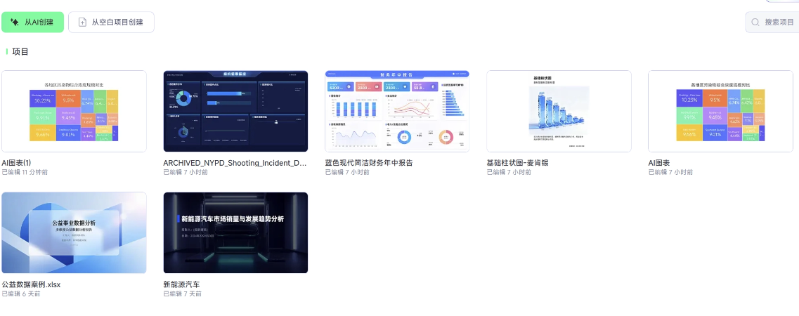
Even more impressive is that Aichart has opened up a complete AI ecosystem and turned itself into infrastructure for data expression:
- API: traditional software can call it
- Agent: large models can call it
- Skill: Agents can call it
Currently, we can experience the out-of-the-box Aichart features in commonly used tools such asFeishu Ailyand NetEase Lobster, Tencent QClaw、OpenClaw .
 03. Some Sharing
In the past, whenever monthly reports, quarterly reports, or annual reports came around, just thinking about them gave me a headache. Collecting and organizing data, finding templates, making charts, and writing analysis reports—every step was excruciating. Much of the time, the energy consumed by preparing reports was not spent on the thinking itself.
Now the entire process has finally been rewritten by AI.
I have also used quite a few AI chart tools. Many products stop at the step of generating charts, but in real work, after a chart is made, you may need to change the data, change the title, change the layout, turn it into a version suitable for your boss, turn it into a version suitable for clients...
The most practical feature of Aitubiao is its in-depth editing, which makes charts a work material that can be continuously iterated on at any time according to needs.
More importantly, Aitubiao's chart generation is built on an understanding of the data, and it also has built-in data structure recognition and validation capabilities. The charts it ultimately generates not only fit the data itself, but are also more accurate, so they are fine to use in business reports.
Data analysis will increasingly become a basic expressive ability, gradually shifting from a professional skill of a few people to a daily ability for more positions.
Choosing templates and doing layout should not take up too much of our time in the first place; just leave it to AI. People should save their energy to understand the business and distill insights.
This is the way workplace professionals in the AI era should work.
Original link:Office worker reporting cheat! Business-savvy AI charts are here