
Today let's share something suited for frontend work.
To be honest, some AI Agents these days have terrible frontend aesthetics: layouts are overly centered, cards are stacked, gradients are overused, whitespace and hierarchy feel unnatural, animations lack rhythm, and fonts and spacing lack a premium feel, making the resulting webpages look cheap. The prime example is Codex.
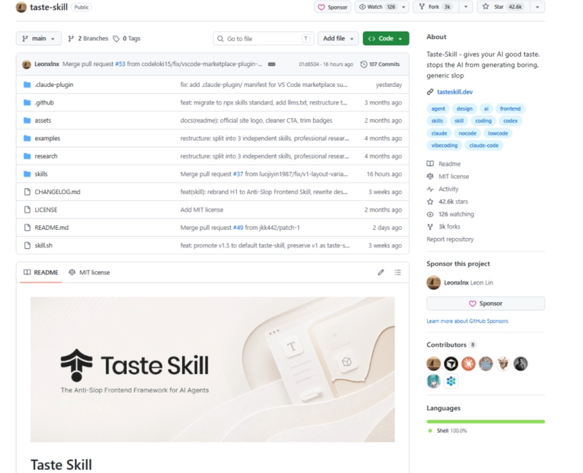
A few days ago I finally found a project on GitHub called Taste Skill that can solve the problem of poor AI Agent aesthetics. The project repository currently has about 40,000+ stars.
01 Project Overview
Taste Skill is a frontend design skill library for AI Agents, with the goal of helping AI break away from templated, homogenized, aesthetically lacking frontends.
It turns layout, typography, motion, spacing, visual density, design language, and other things that originally required design experience to judge into SKILL.md instructions that AI Agents can read and execute, in order to improve the design judgment of AI when generating interfaces.。
Taste Skill currently includes multiple skill modules for different purposes, each module solving a specific problem:
- design-taste-frontend: The default Skill, which infers the design language based on requirements and controls output through several key dimensions, such as layout variation, motion intensity, information density, etc.
- gpt-taste: A strict version suitable for GPT/Codex, with higher requirements for layout variation, GSAP motion, and anti-templating.
- image-to-code: Suitable for scenarios where you first need to make webpage reference images and then have AI recreate them as frontend code.
- redesign-existing-projects: Used to revamp existing projects. First review the existing UI, then fix issues with layout, spacing, hierarchy, visual style, etc.
- high-end-visual-design: A high-end, restrained, refined visual style, emphasizing soft contrast, whitespace, font texture, and natural motion.
- minimalist-ui: A modern minimalist product interface in the style of Notion, Linear, etc., suitable for SaaS, tool-type products, developer products, and content-oriented backends.
- industrial-brutalist-ui: An industrial style, rough feel, Swiss typography, strong contrast, and experimental layout, suitable for more distinctive and sharper visual expression.
- full-output-enforcement: Used to constrain AI from only giving half-finished products, placeholders, or omitted code, suitable for dealing with incomplete Agent output.
- Image generation-related skills: Includes imagegen-frontend-web, imagegen-frontend-mobile, brandkit, used to generate website visual drafts, mobile interface flows, brand visual boards, and other reference images, which are then handed to Codex, Cursor, or Claude Code for implementation.
npx skills add https://github.com/Leonxlnx/taste-skill npx skills add https://github.com/Leonxlnx/taste-skill --skill "design-taste-frontend"- Codex hands-on test 1
Let's generate a webpage separately in two cases, without Skill and with Skill, and compare the results.
Without Skill:
Prompt:
Help me implement from scratch the first screen of an AI Agent product official website, without using any skill.
Product name: LoopPilot
Product positioning: An AI Agent workspace that helps teams automatically plan, execute, and review tasks.
Target users: Independent developers, small teams, AI product managers.
Page vibe: Avoid a generic SaaS template feel, avoid large blue-purple gradients, and avoid stacking cards. We want a refined, restrained, clear information hierarchy, with a slight futuristic and tool-like feel.
Please complete the following:
- Design a complete hero section
– Include the product name, main headline, subheadline, primary CTA, and secondary CTA
– Show 3 core capabilities: automatic task breakdown, continuous execution, and retrospective optimization
– There needs to be a product interface preview area, but it should not look like a generic dashboard template
– The hero section must have a clear visual memory point
- Design style requirements
– Use a non-template layout and avoid centering and stacking all content
– Font hierarchy should be clear; the headline should have impact but not be rough
– Keep colors within 3-5 primary colors
– Motion effects are allowed, but they should serve information expression, not show off
– The page needs to adapt to both mobile and desktop
- Code requirements
– Please directly output complete runnable code
– Do not use placeholders and do not omit any key code
– Do not only provide design suggestions; actually implement the page
– If components are used, please make sure all components are fully written out
– If styles are needed, please fully write out the CSS / Tailwind classes
- Acceptance criteria
– At first glance, the page must not look like an AI default-generated SaaS template
– The visual hierarchy should be clear and the CTA should be obvious
– It should still hold up in a 9:16 mobile screenshot
– All text must not overflow or overlap
– The final result should look like the hero section of a real product about to launch
Please first briefly explain your design direction, then directly provide the complete implementation.
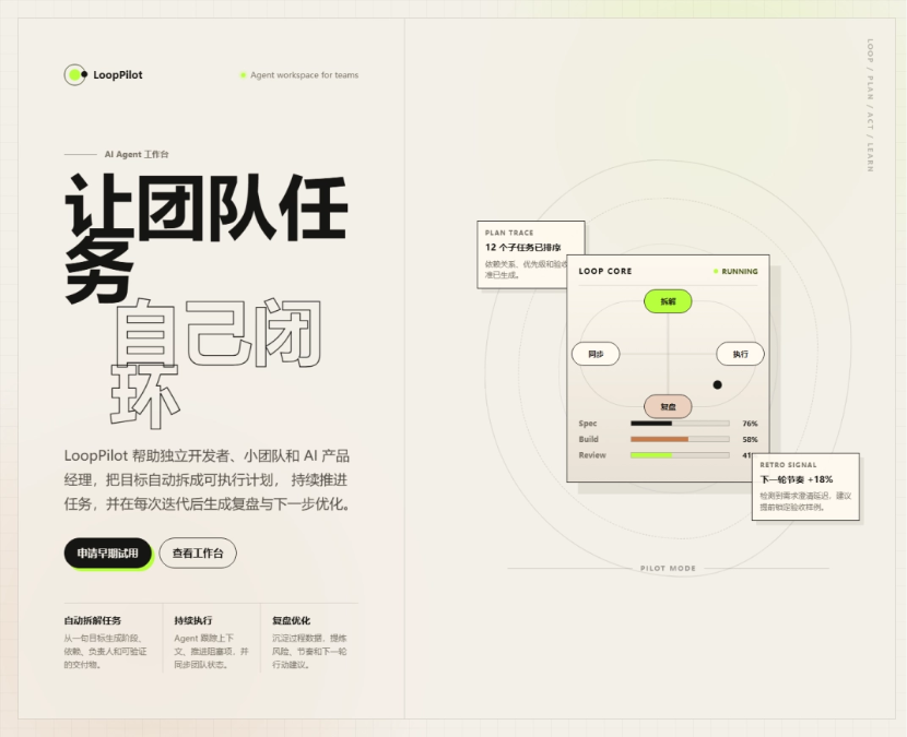
Desktop effect:
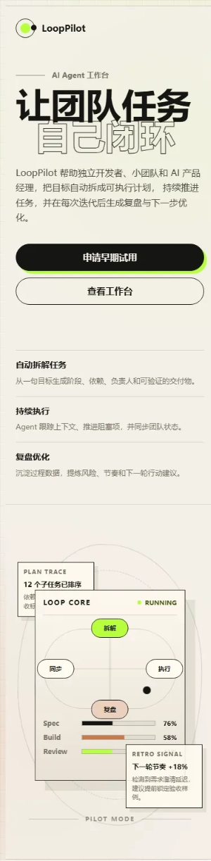
Mobile effect:
The version without the Skill did not fall into the ordinary SaaS hero formula of “centered headline + three cards + blue-purple gradient.”
But the product feel is weaker; the workbench on the right looks like a decorative image. Users are drawn to the large headline and graphics, yet in the end it is hard to sort out how the product helps teams work and how it forms a closed loop.
The mobile version is still viewable, but the headline line breaks are a bit stiff.
Using Taste Skill:
Prompt:
Please use design-taste-frontend and full-output-enforcement from Taste Skill to help me implement an AI Agent product official website hero section from scratch.
Product name: LoopPilot
Product positioning: an AI Agent workspace that helps teams automatically plan, execute, and review tasks.
Target users: independent developers, small teams, and AI product managers.
Page vibe: Avoid a generic SaaS template feel, avoid large blue-purple gradients, and avoid stacking cards. We want a refined, restrained, clear information hierarchy, with a slight futuristic and tool-like feel.
Please complete the following:
- Design a complete hero section
– Include the product name, main headline, subheadline, primary CTA, and secondary CTA
– Show 3 core capabilities: automatic task breakdown, continuous execution, and retrospective optimization
– There needs to be a product interface preview area, but it should not look like a generic dashboard template
– The hero section must have a clear visual memory point
- Design style requirements
– Use a non-templated layout, avoid centering and stacking all content
– Clear font hierarchy, headlines should have impact but not be crude
– Keep colors within 3-5 primary colors
– Motion effects are allowed, but they should serve information expression, not show off
– Pages need to adapt to mobile and desktop
- Code requirements
– Please output complete runnable code directly
– Do not use placeholders, do not omit any key code
– Do not only give design suggestions, actually implement the page
– If using components, make sure all components are fully written out
– If styles are needed, write out the complete CSS / Tailwind class
- Acceptance criteria
– The page must not look like a default AI-generated SaaS template at first glance
– Clear visual hierarchy, obvious CTA
– It must also hold up in 9:16 mobile screenshots
– All text must not overflow or overlap
– The final effect should look like the hero screen of a real product about to launch
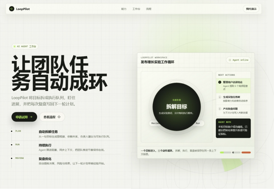
Desktop effect:
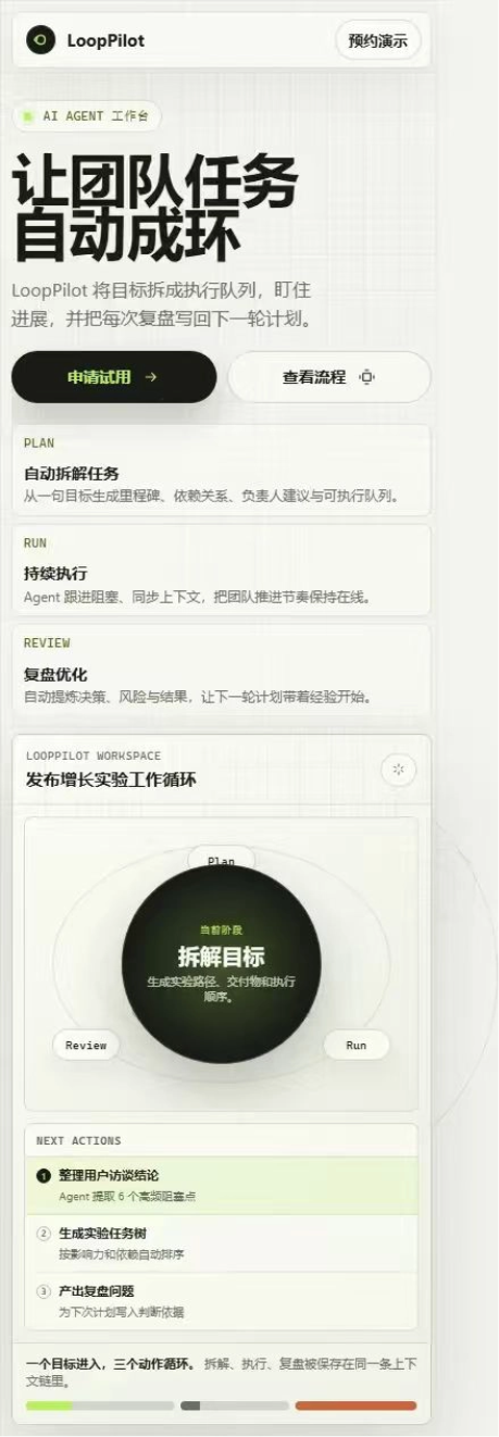
Mobile effect:
Please first briefly explain your design direction, then directly provide the complete implementation.
Adding a top navigation with Taste Skill makes it look very comfortable; which website doesn't have a navigation bar at the top nowadays?
The product preview on the right is no longer just an abstract graphic; users can understand the product path through step-by-step text.
The mobile performance is also more mature; capability points become independent information blocks, and the reading order feels natural.
- Codex hands-on test 2
Of course, existing projects can also have their frontend refactored once with Taste Skill.
Prompt:
Please use redesign-existing-projects, minimalist-ui, high-end-visual-design, and full-output-enforcement from Taste Skill to help me refactor the homepage of an existing project's official website.
Project location:
D:\360MoveData\Users\win\Desktop\公众号\wechat-topic-dashboard-ugly-homepage
Background:
This is the homepage of the official website of a "WeChat Official Account topic management platform". The product is called Content Desk. It is aimed at content teams on WeChat Official Accounts, Xiaohongshu, WeChat Channels, Zhihu, etc., helping them manage topics, assign owners, track status, and view AI recommendations and content performance.
Current problems:
The current page has both functionality and information, but the visuals are very templated:
– The blue-purple-pink gradient is too heavy
– The large headline is flashy
– The page is overly centered
– Cards are severely stacked
– CTA is repeated
– Product screenshots are decorative, not like a real product
– The information hierarchy is loose
– The mobile reading path is very long
– Overall it looks like an ordinary AI-generated SaaS landing page
Refactoring goals:
Without changing the product theme and core information, refactor it into a more professional, more restrained, and more trustworthy homepage for a content operations tool. The final effect should look like the official website of a real SaaS product about to launch, not a template page.
Please complete the following:
- Hero section refactoring
– Keep the product name Content Desk
– Keep the product positioning: a WeChat Official Account topic management platform for content teams
– Needs to have a clear main headline, subheadline, primary CTA, and secondary CTA
– Do not use exaggerated expressions like "300% efficiency boost"
– The first screen must display a believable product interface preview; do not make it an ordinary decorative image
– Visually, it needs a memorable point, but must not be flashy
- Product capability showcase
The following capabilities need to be showcased:
– AI topic recommendations
– Multi-platform topic management
– Status and owner tracking
– Deadline and priority management
– Content risk reminders
– Publishing performance review
Do not simply stack 6 large cards for the presentation; reorganize the information hierarchy based on content operations scenarios.
- Workflow showcase
Show a content team's process from topic selection to review:
– Collect trending topics
– Evaluate topics
– Assign writing
– Review and publish
– Data review
The process should echo the product interface; it should not just be ordinary step 1, 2, 3 cards.
- Page style requirements
– Lean toward Notion / Linear / Feishu Bitable / modern B2B SaaS tool feel
– Restrained, clean, credible
– Moderate information density; do not make it too empty
– Do not use large areas of blue-purple gradients
– Do not stack large rounded cards
– Do not use exaggerated shadows
– Do not use marketing speak
– Have clear layout rhythm, whitespace, typographic hierarchy, and status colors
– Desktop-first, while also working naturally on mobile
- Code requirements
– Directly modify the existing files in the project
– Output a complete runnable version
– Do not omit code
– Do not use lorem ipsum
– Do not only give design suggestions; actually implement the page
– Ensure text does not overflow or overlap on desktop and mobile
– A pure static HTML / CSS implementation is sufficient; no need to introduce complex frameworks
- Acceptance criteria
– At first glance, it must not look like a default AI-generated SaaS template
– The product interface preview must be believable; it should be clear that this is a "content topic management tool"
– The CTA is clear but not noisy
– Capabilities and workflow are not stacked cards, but organized around real content operations scenarios
– Mobile reading order is natural
– The visual difference before and after refactoring must be obvious
– The final page is suitable as a real-world case showcase of Taste Skill refactoring an existing project
Please first briefly point out the main problems of the original page, then explain your refactoring strategy, and then directly modify the project files and provide the complete implementation.
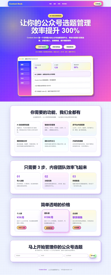
Original desktop effect:
Original mobile effect:

The original page's blue-purple-pink gradients and heavy shadows are too eye-catching, the first screen is overly centered, and both features and workflow are evenly stacked cards.
The product screenshot in the middle is also somewhat decorative; the data and interface structure inside look fake, more like a mockup placed to fill the first screen.
The mobile issues are even more obvious: navigation, title, buttons, screenshot, and feature cards pile down one after another, the reading path is very long, and the visual noise is heavy.
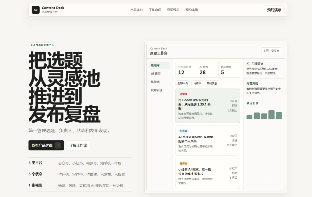
Effect after refactoring on desktop:
Effect after refactoring on mobile:

After the refactoring, the page layout looks much more pleasing, whereas the original page colors were so harsh they practically hurt your eyes.
On desktop, the left side shows the product positioning and core data, while the right side is a credible preview of the topic selection workbench. Users can understand at a glance: this is a tool for managing topic selection, status, AI suggestions, risks, and publishing performance.
The information order on mobile becomes: brand navigation, product positioning, main headline, CTA, core data. Users do not have to wade through a bunch of gradients and marketing talk first and can understand what the product is more quickly.
03 Dig into itAI Agents are becoming part of the development process.
The Stack Overflow 2025 Developer Survey shows that 84% of developers have already used or plan to use AI tools, among whom 51% of professional developers use them every day.
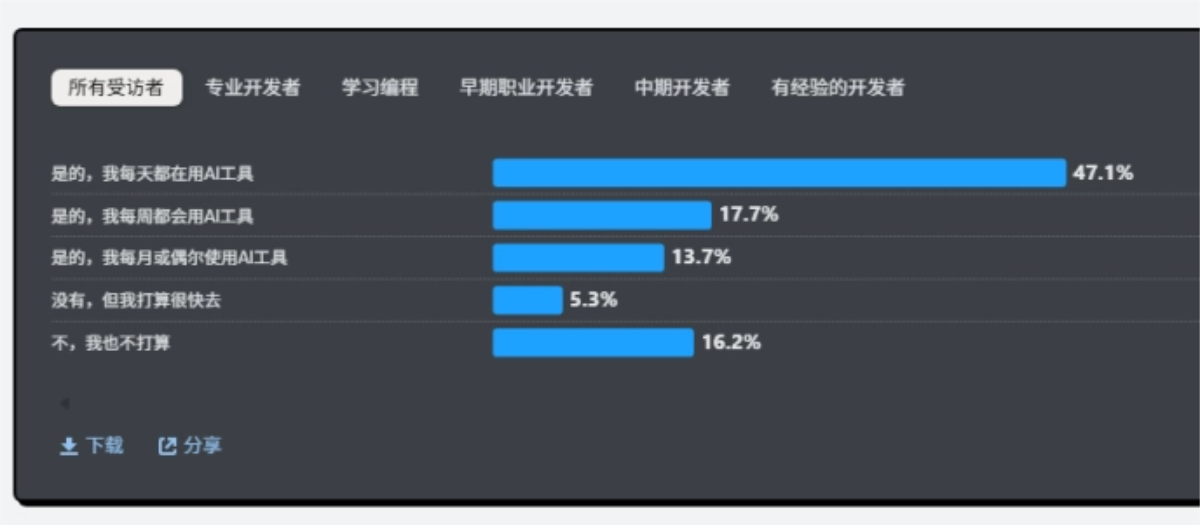
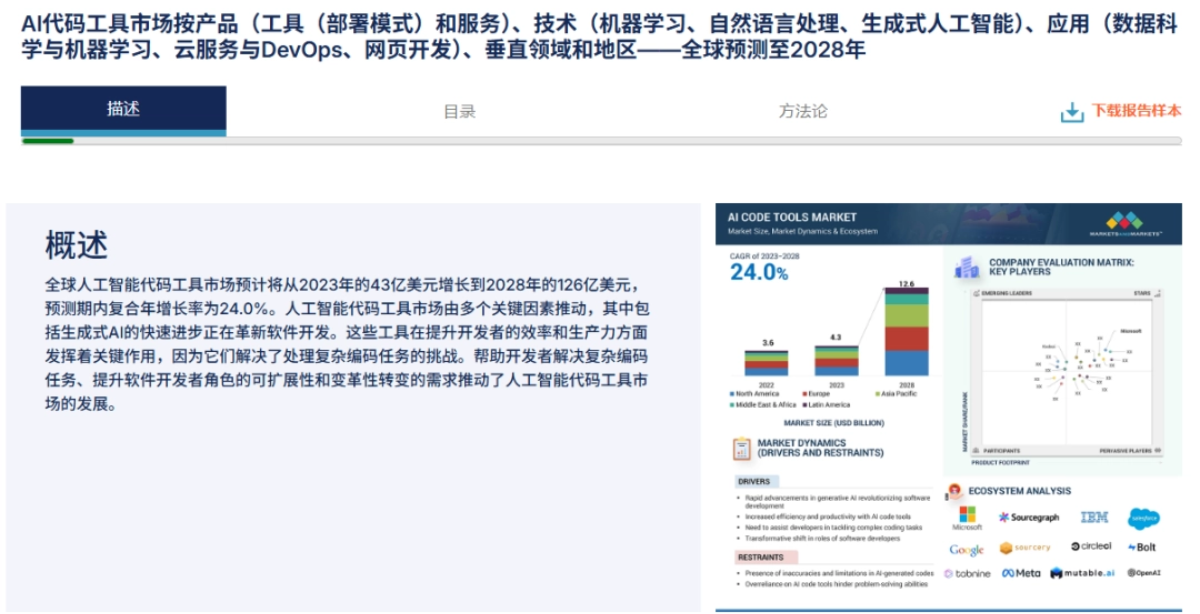
At the same time, the AI Code Tools market is expected to grow from $4.3 billion in 2023 to $12.6 billion in 2028.
But just because AI can write code does not mean it can build products. Especially for front-end pages, many results generated by Agents still remain at the Demo stage.
Taste Skill packages front-end designer experience and aesthetics into skill rules, enabling AI Agents to generate interfaces that are closer to real product delivery standards.
It solves several of the most common pain points in AI front-end development: templated pages, excessive stacked cards and gradients, rough mobile adaptation, lack of credibility in product previews, chaotic information hierarchy in admin backends, and high refactoring costs for existing projects.
Taste Skill can be used for AI product homepage hero sections, SaaS landing pages, admin management systems, content operations workbenches, Agent product demos, client project prototypes, and UI refactoring of existing projects.
For small teams without a complete design team, it can significantly reduce the cost from idea to MVP and from Demo to a presentable product.
The value of Taste Skill is precisely that it turns front-end aesthetics and product judgment into a reusable form of AI productivity.
Original link:GitHub racks up over 40,000 Stars, letting AI generate tasteful front-end pages