
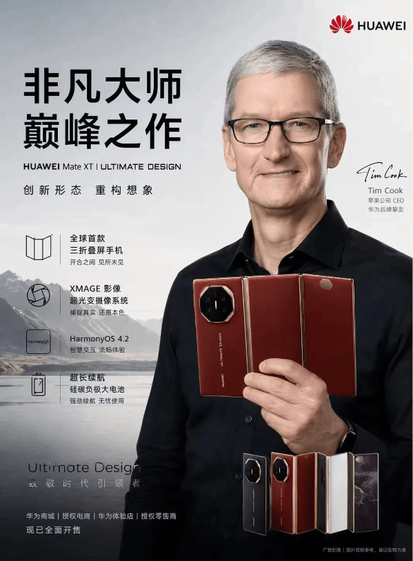
RecentlyImage2went viral, with memes flying all over the internet. Apple CEO Cook had just endorsed Huawei.
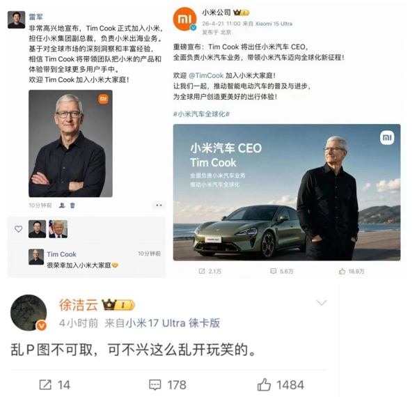
Then right after, he became vice president of Xiaomi Group and also CEO of Xiaomi Auto, and even an official Weibo screenshot was mocked up. This forced Xiaomi executives to urgently deny it.
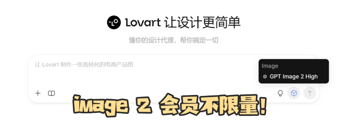
The memes above were all generated by Image 2, and this wave of image generation capability is truly explosive. Lovart also updated Image 2 on schedule, with unlimited free use for members for 30 days.
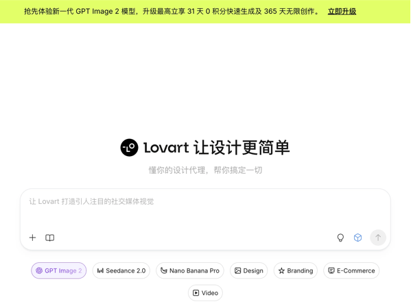
Taking advantage of this free membership wave, I quickly ran 5 real cases, from professional designers to brand marketers to ordinary AI players, covering a variety of demand scenarios, and thoroughly probed the limits of Lovart Image 2 from every angle.
01. Hands-on Test of Lovart Image 2
Case 1: Coffee Brand Proposal
Let's first test a scenario professional designers often encounter: making a brand poster for a boutique coffee shop called "Shanye Coffee." The client had nothing and just gave a name and three days. Designers, isn't this all too familiar? In the past, you'd have to spend three days scrolling Pinterest for references, then make a moodboard, then produce the key visual, then choose fonts, then adjust extensions...
Now, open Lovart and throw in one sentence:
Generate a brand key visual poster for the boutique coffee brand "Shanye Coffee."
Image specs: 4:5 vertical, 3000×3750 pixels, print-grade 300dpi.
- Composition requirements: Place a close-up of pour-over coffee at the lower-center third, with the cup diameter presented at an 8cm ratio, and fine crema texture on the coffee surface;
- Background: A Japanese machiya wooden lattice window scene, with blurred greenery outside extending into the upper-left quadrant of the frame, forming foreground-midground-background three-layer depth (f/2.8 equivalent shallow depth of field).
- Lighting: Natural side-window light at 10 a.m., color temperature 5200K, forming soft highlights on the coffee surface, with a 15° shadow cast on the wooden tabletop.
Text specifications: The main title "Shanye Coffee" must be presented in authentic brush running script, with ink density variations consistent with brushstroke logic, slightly dry at the starting strokes and naturally feibai at the ending strokes;
- Title position: In the upper-third blank area of the image, forming a diagonal echo with the greenery. The text must physically interact with the scene—the final stroke of the character "野" must seem to have coffee steam curling upward, with the ink color and warm steam tones forming a slight bleed, proving that the text "grows" from the scene rather than being overlaid in post.
- Color management: Base warm off-white #F5F0E8, dark roast brown #3E2723 used for the text and dark areas of the tabletop, greenery only as an accent. Global desaturation treatment, simulating Fujifilm Provia 100F color science.
- Output requirements: Zero AI text edge jaggedness, zero floating feeling, zero digital sharpening traces, directly ready for the print shop to output film.
Image 2 really understood what curling upward means, and the lighting and atmosphere were handled very well.
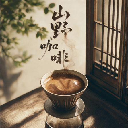
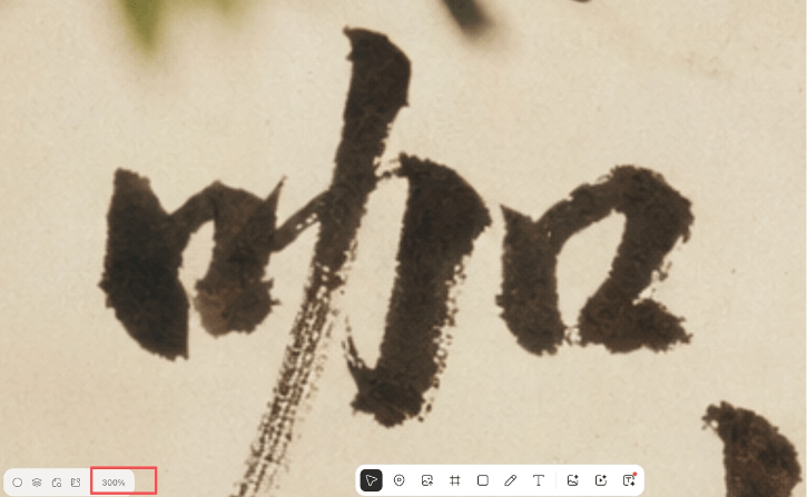
Zoom in 300% to look at the edges of the four characters "Shanye Coffee," and you can see the interlocking of real brush fiber texture with the wood grain of the tabletop, rather than vector outlines. The dry ink at the starting strokes and the feibai at the ending strokes are completely consistent with the shadow direction formed by the 5200K side light in the background.
But that's not all. I casually opened the font generator and uploaded the photo just generated into it.
In three minutes, a set of exclusive "Shanye Coffee" font library came out.
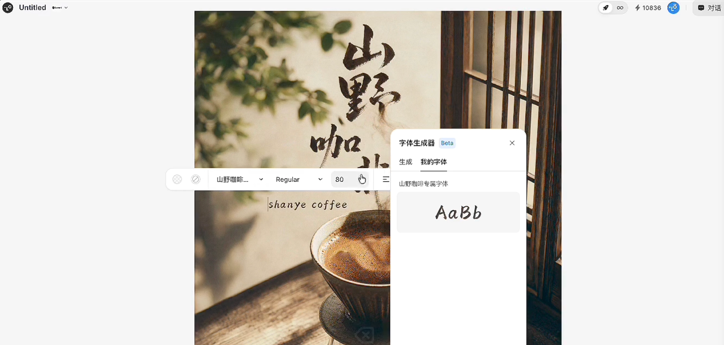
After this handwritten typeface is generated, it is a real writing asset that can be used for brand trademark registration, and cannot be bought elsewhere.
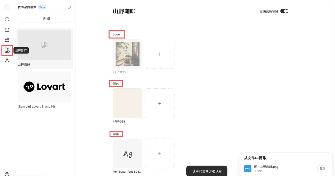
Then with one click of the Brand Kit, the Logo, color palette #F5F0E8/#3E2723, and exclusive fonts are all locked in. When subsequent menus, cup sleeves, and packaging bags are attached to this project, the resulting images automatically carry the brand specifications, with cross-batch color error <ΔE 1.5, meeting Pantone color management standards. Style drift? Doesn't exist.
Finally, drag Multi-Angles, and switch between 3:4 (Xiaohongshu) and 9:16 (Douyin) compositions with one click. The client says they want a WeChat Moments cover, done in ten seconds, no need to rerun the image.
What used to be three days of work is now one afternoon. And what's delivered isn't a few scattered images, but a brand system with specifications, scalability, and traceable colors.
Case 2: Coffee brand Douyin livestream e-commerce clip
Directly take our Case 1's Mountain Coffee and set up a livestream e-commerce clip image. Previously, this kind of clip process generally involved shooting video, cutting clips, adding subtitles, adjusting effects, and one video would take half a day.
Now directly throw a prompt to Lovart:
Generate a Douyin livestream e-commerce clip dynamic poster, image specifications: 9:16 vertical, 1080×1920 pixels, video frame capture texture. Product: drip coffee bag.
Composition: top-bottom split narrative—top 60% is the product hero shot, left side is a close-up of the host holding the product, right side is the livestream UI overlay; bottom 40% is the native Douyin livestream interface, including a real-time sales counter "Sold 1,000,000+ cups" (monospaced font ensures digit alignment when animating), limited-time countdown "23:59:59" (colon vertically centered), bullet chat area scrolling real user comments ("Finally got it" "This taste is addictive"), bottom "Buy Now" button (rounded corners 8px, shadow 0 4px 12px rgba(0,0,0,0.15)). UI precision requirements: all elements strictly match Douyin livestream 8.2.0 native specifications—sales badge rounded corners 4px, corner mark red #FF2442, user avatar 40px rounded, timestamp format "2 minutes ago". Host's expression is natural, like a real livestream screenshot, no AI feel. The image has slight motion blur, like a video frame capture. Text layers must support later dynamic tracking, each UI layer independently separated.
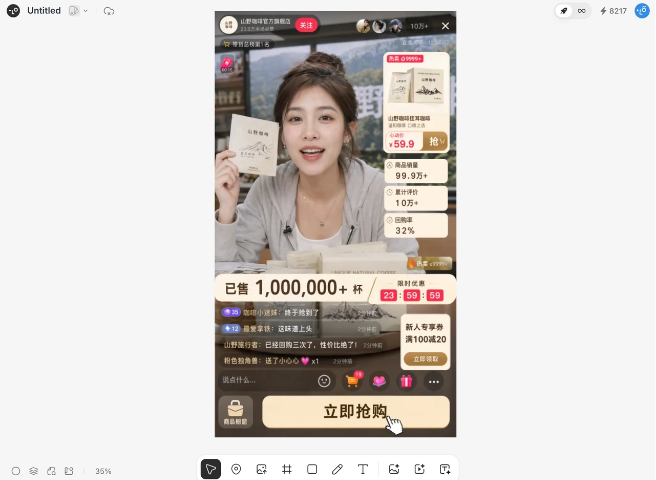
Image 2 comes out in about 3 minutes, and at a glance, who can tell real from fake.
Let's check the details again, pixel by pixel. The "Sold" number is monospaced, the countdown colon is vertically centered, the bullet chat scrolling speed matches Douyin's 60fps smoothness—no problems. The price tag font, the flash sale countdown number style, the product showcase layout, are almost identical to a real Douyin livestream. It looks right, and the details match up. Not bad.
Then here's the key part: within the Lovart canvas, I can directly describe in text and change the female host's clothes. First, change the host into a new Chinese-style outfit.
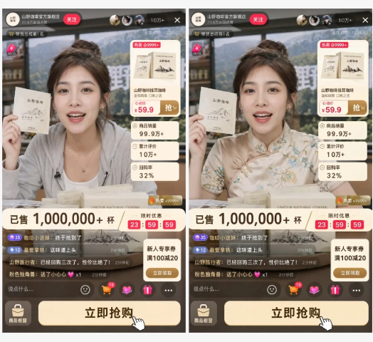
Then boost the sales, directly from 1 million cups to 9 million cups.
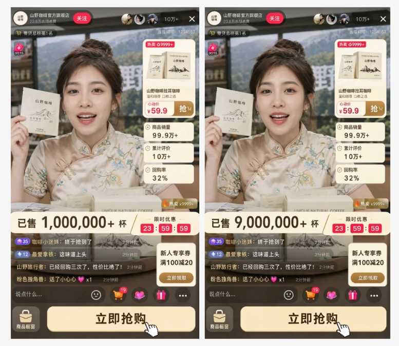
Whether it's speed or quality, it holds up.
You can also generate livestream videos one-stop in Lovart, directly choose seedance2.
Case 3: Coffee brand ordinary-user Xiaohongshu seeding image
Livestream is done, now arrange Xiaohongshu seeding for our Mountain Coffee.
Anyone who does branding knows, what's the biggest fear with seeding images now? Fear of fakeness. Fear of the AI feel. Skin smoothed like a porcelain doll, lighting like stage lights—this kind of obvious fake can't capture users' attention.
So if you get this kind of request, what do you do: want six ordinary-user coffee seeding images, six scenes, required to look like casually shot by a friend, don't let people tell it's AI.
I wrote the prompt like this:
Generate 6 real user-generated content (UGC) style coffee seeding photos, image specifications: 1080×1440 pixels (4:5), 72dpi simulating native phone compression texture. Scene settings:
1) Bedroom vanity, cluttered cosmetics storage in the background, mirror reflection with fingerprint smudges and oil stains, mixed light from the desk lamp on the right and the window on the left, inconsistent color temperature; 2) Subway car, holding a coffee cup, motion-blurred background, flickering overhead fluorescent lights, skin tone affected by reflections from the car walls;
3) Office workstation, keyboard, coffee cup, and sticky notes in frame, overhead light + screen reflections causing facial chiaroscuro division;
4) Outdoor cafe terrace, natural light at 3 PM, dappled tree shadows cast on the face, iPhone overexposure characteristics;
5) University library, mixed overhead fluorescent lights + desktop lamp, stacks of books forming background depth of field, bare-face feel base makeup;
6) Sunbathing on the balcony, afternoon side light, natural clothing wrinkles, blurred background with city skyline.
Core technical requirements: iPhone 14 Pro native camera aesthetic—highlights slightly overexposed, shadows with lifted blacks, natural skin texture with visible pores and fine lines, no beauty smoothing, real dark circle texture, stray hairs floating.
Lighting must be organically mixed: indoor fluorescent + window light, midday hard light + long shadows, golden hour warm tones. Colors simulate iPhone photography style, standard processing, slight desaturation.
Product integration: the coffee cup must be in a natural handheld state, not center-framed, with real fingerprint smudges and condensation droplets on the cup wall. No studio lighting, no stiff posed model feel, no perfectly symmetrical composition.
Flaws are mandatory.
Output: the platform algorithm cannot recognize it as AI-generated; comment section users asking "what filter did you use" is the qualifying standard.
The image generated by Image 2, who can tell this is AI-generated!
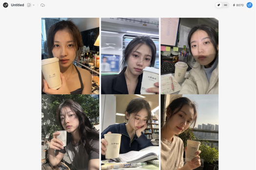
Zoom in on one to show the friends this lighting and shadow, this skin texture, even the hair strands are so real.
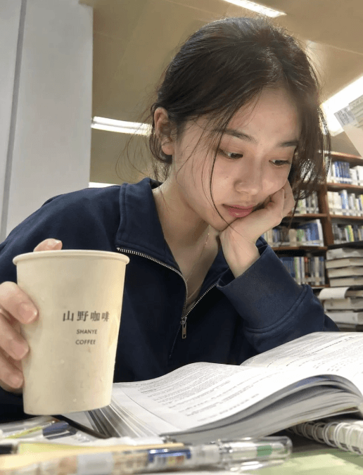
I sent it to the group and let friends guess, half of them said they couldn't tell it was AI-generated.
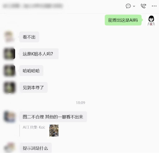
But this job isn't done yet.
The client said, "Add a Xiaohongshu interface to it, make it look like a real screenshot," directly enter the client's request in the dialog box, done in 3 minutes.
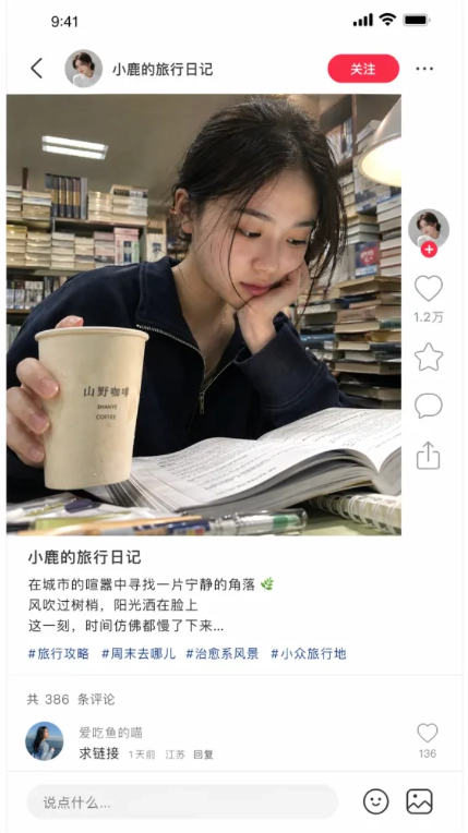
Take a look at the overall effect.
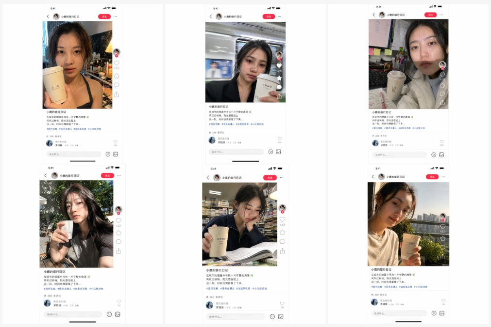
Of course you can also switch it to an Instagram interface, same operation.
Anyway, I can't tell real from fake anymore.
Case4: 90s retro
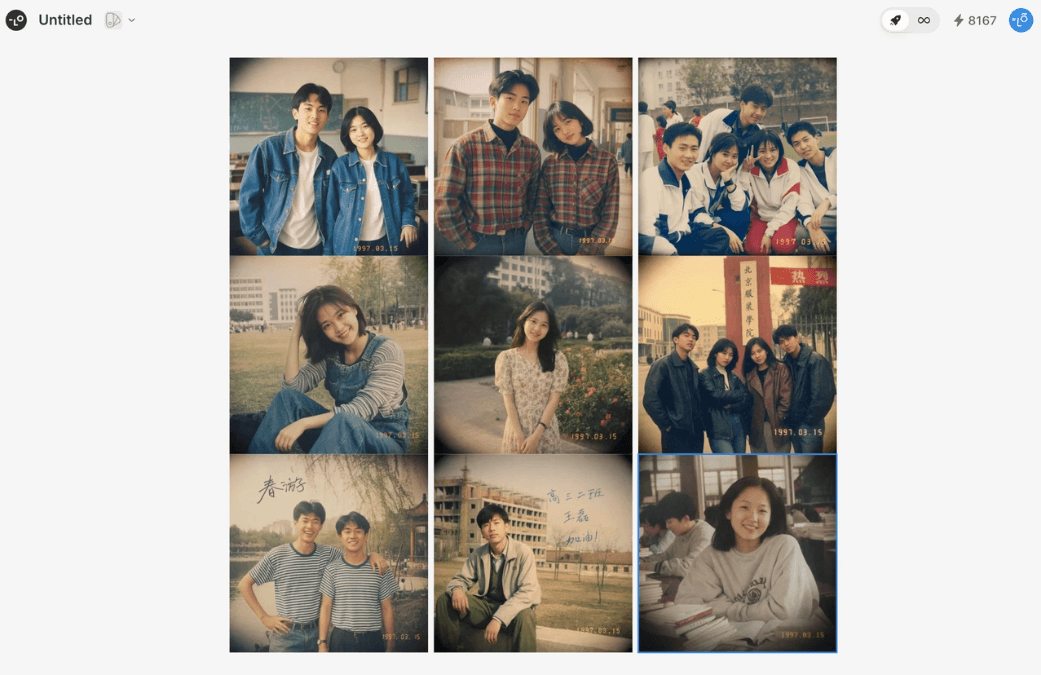
This case is purely because I wanted to play around myself. The retro style is really popular lately, I want to make a set of 90s yearbook photos, nine different looks, unified color tone, and post them on Moments.
In the past, I had to generate them one by one, adjust the style, piece together a nine-grid, and the style easily went off track.
Lovart's infinite canvas outputs nine at once, I first throw in the prompt:
Generate 9 90s-style yearbook photos, unified retro warm color tone,
Image specifications: 1080×1080 pixels (1:1), simulating Fujifilm Superia 400 film color science, lifted blacks + slight fading. Each one is a different young Asian person, outfits covering: denim jacket, plaid shirt, tracksuit, overalls, floral dress, leather jacket, hoodie, striped T, cargo pants.
Technical requirements: each photo has real film grain (ISO 400 noise characteristics), edge vignetting (lens falloff), date stamp "1997.03.15" in monospaced font simulating film print. Some photos contain handwritten annotations, such as "Senior Class 3-2" "Spring Outing", which must be presented in real ballpoint pen/fountain pen handwriting, ink penetrating into the photo paper fibers, consistent with the film fading texture. Natural facial expressions, like yearbook photos, remove the AI feel. Nine photos with unified style, like an album series of the same person, no single image allowed to have a color shift exceeding ΔE 5.
This time, let's look at the handwriting first. Zoom in on the four characters "高三二班"—it looks so real. The handwriting isn't floating on the image; it really looks like it was written on the photo, and this ugly-cute font is exactly like my deskmate's.
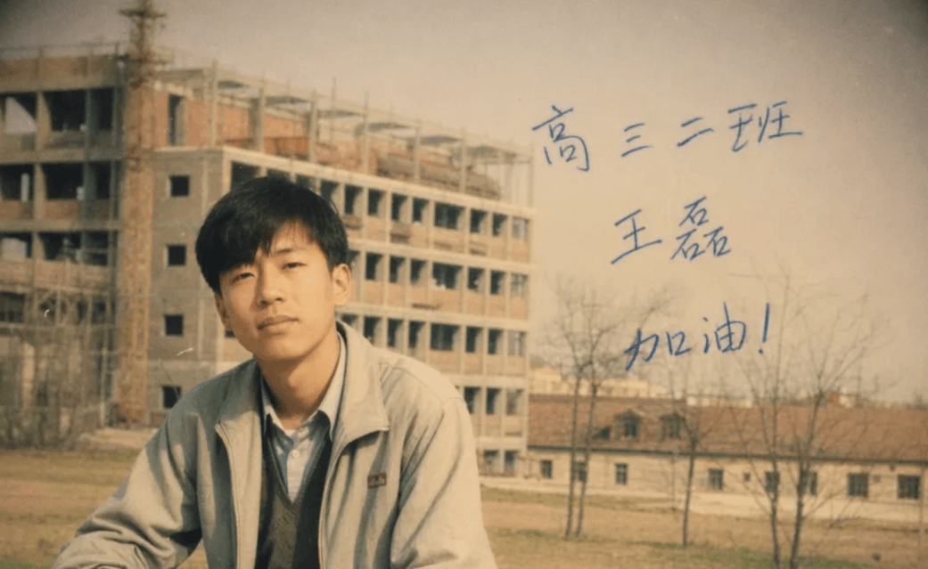
Just take these nine images and post them on Xiaohongshu with the caption: My parents' outrageously good looks from back in the day. Guess how many likes this will get?
Lovart can also use an infinite canvas plus Text Edit to batch-generate images and flexibly change text, instantly becoming a social media content mass-production tool.
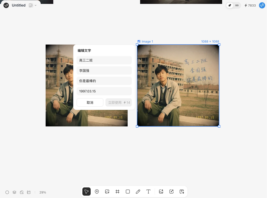
For example, change 王磊 to 李国强.
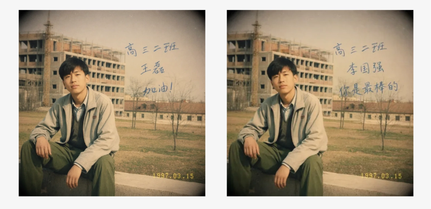
The handwriting font stays unchanged—impressive.
Case5: Amazon multilingual e-commerce solution
For the last case, a friend in cross-border e-commerce came to me asking for product images in four languages—English, Japanese, Korean, and Chinese—adapted for Amazon, with PSD files delivered in the end.
I threw in one prompt:
Generate an Amazon A+ content main image for a portable coffee machine.
-Image specifications: 3000×3000 pixels, pure white background #FFFFFF, product shadow angle 135°, blur radius 8px, opacity 25%.
-Layout specifications: strictly follow Amazon A+ module standards—the product subject occupies the left 60% of the image, and the right 40% is a three-tier information hierarchy area.
-Multilingual parallel generation: simultaneously output English/Japanese/Korean/German versions. Each version must use culturally adapted fonts—for English use San Francisco Bold, for Japanese use Yu Mincho and allow vertical titles, for Korean use Nanum Gothic and optimize letter spacing to 1.2x line height, for Chinese use Source Han Sans Heavy. The text in each version must not be merely translation replacement; it must be localized typographic reconstruction.
-Clear hierarchy of image elements: foreground product layer/midground information layer/background pure layer are distinct, making later separation easy. Use Amazon Skill standard sizes and layouts.
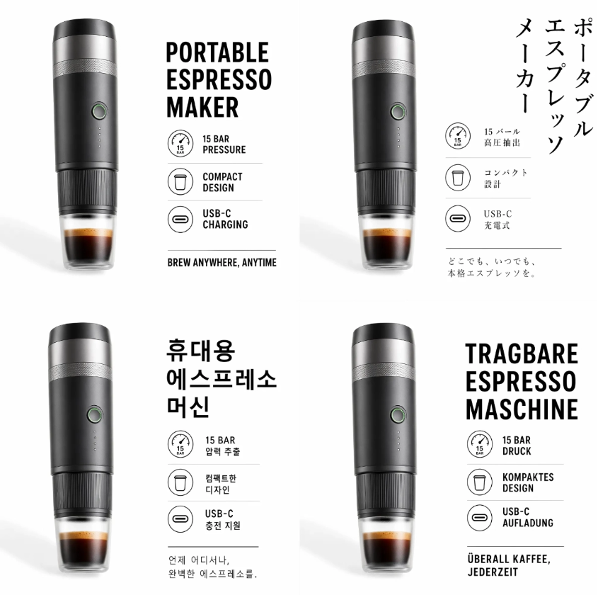
For the multilingual rendering in Image 2, I first inspected the typography. The Japanese version uses the correct Yu Mincho W6 weight, and the letter spacing isn't cramped; the Korean version has letter spacing at 1.2x line height, matching Korean e-commerce visual standards; the English title in San Francisco Bold has a designed contrast in weight; the Chinese in Source Han Sans Heavy has a 92% character face ratio and aligns with the English baseline. It doesn't have that jarring feeling of Chinese being forced on.
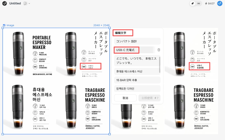
When using Text Edit to change the text, I changed the Japanese "充電式" to "急速充電", and Yu Mincho's weight, line spacing, and character face ratio were all preserved. Text replacement is really convenient.
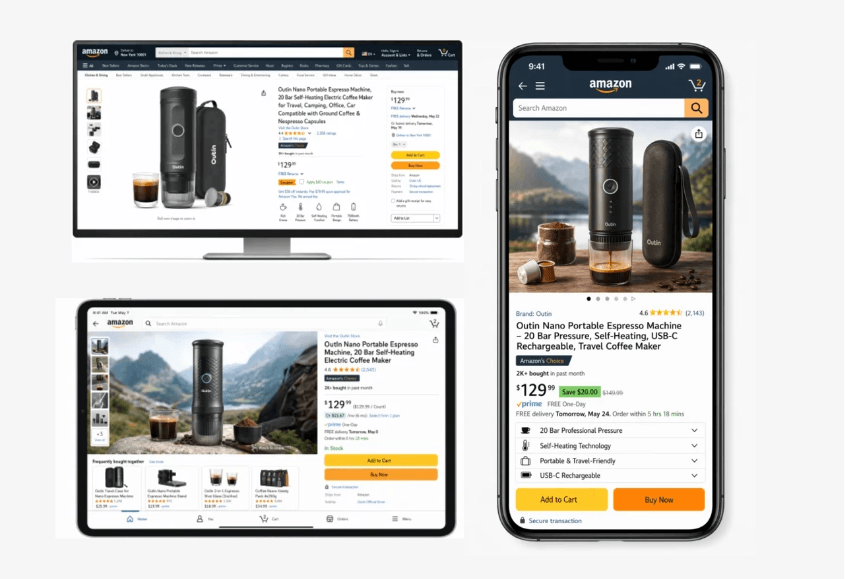
Then Mockup one-click pastes it into Amazon PC/mobile/App previews to verify the readability of the information hierarchy. The product subject's 60% proportion does not intrude into the text safe area, and the three-tier information hierarchy conforms to Amazon A+ visual flow. It's quite worry-free.
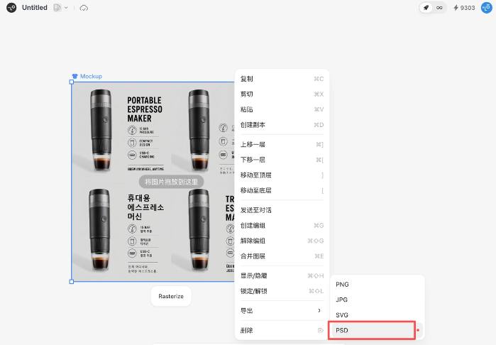
Previously, the biggest awkwardness of AI image generation was no PSD—when the client asks, you're stumped. Now Lovart exports layered PSDs with one click, each layer independently named, with positions exactly matching the canvas, and print shops can directly output CTP plates.
Lovart really understands designers' pain points.
02. Some sharing
I've tested so many AI design tools. To be honest, when it comes to generating a good-looking image alone, many tools can do it. But design work doesn't end at generation—you need to change text, adjust layout, produce multilingual versions, mock up, separate layers, deliver source files, and maintain brand consistency.
If any step gets stuck, all the previous creativity is wasted.
What Image 2 solves is "generation", whileLovartwhat it solves is "delivery"。
Now Lovart's Pro members can use Image 2 unlimited for free. My advice is: don't just look, go use it. Run a few of your own cases, feel it out, and you'll understand.
A single image is a consumable,but a system that can be delivered is an asset. AI has finally started helping designers accumulate assets, rather than producing junk.
🔗 Official website:https://www.lovart.ai/
Original link:image 2 Unlimited image generation is here, I had a blast with Lovart doing full-stack AI design!