
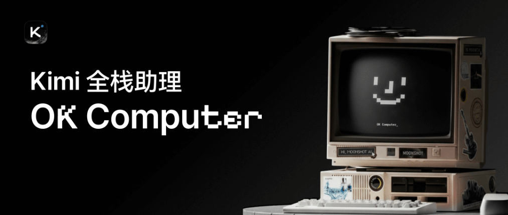
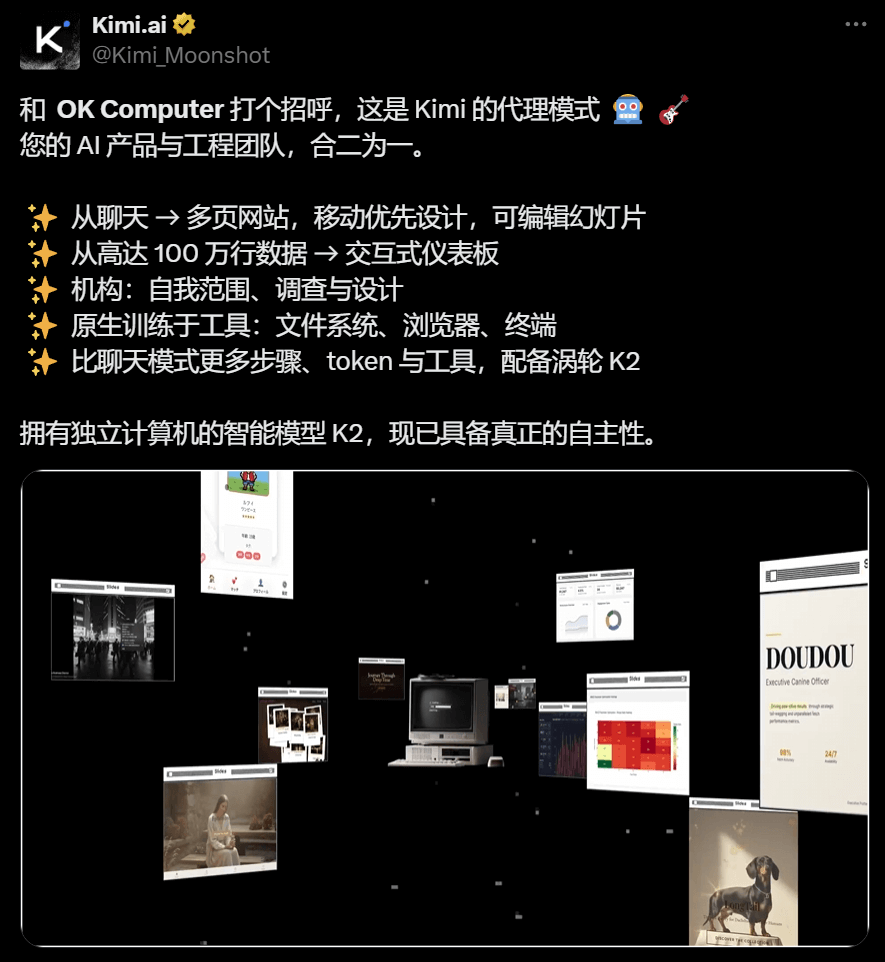
A few days ago, Kimi quietly posted a tweet, officially announcing that the Kimi Agent mode "OK Computer" has begun small-scale gray testing.
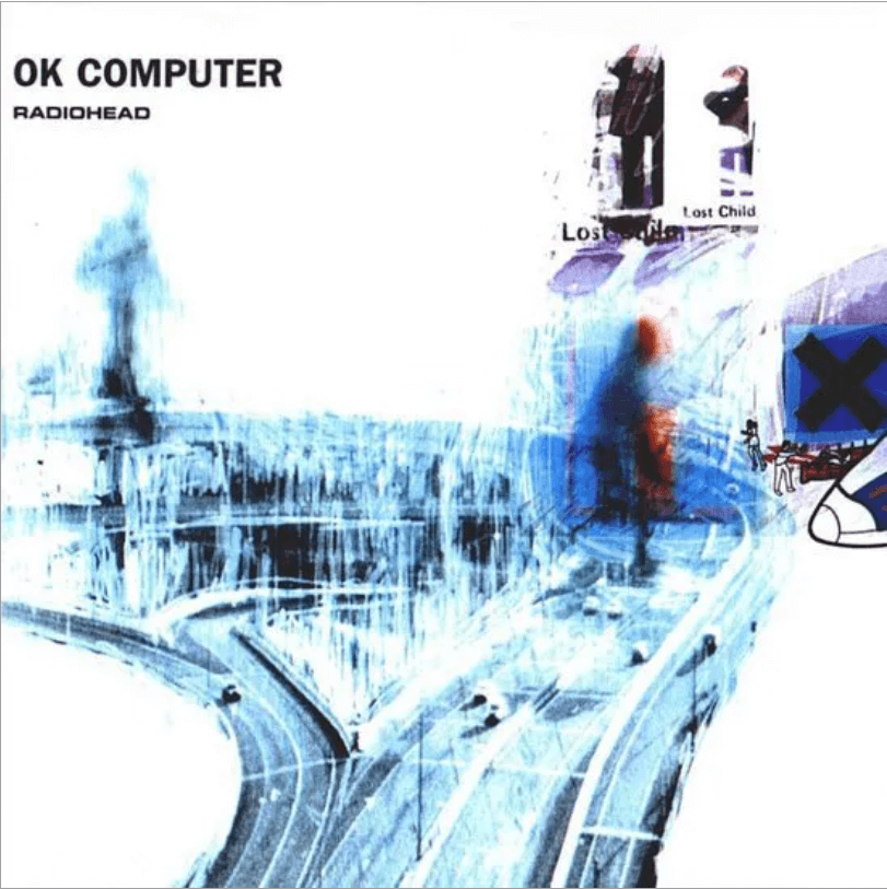
The name OK Computer is quite interesting. Those in the know will understand—it's the name of Radiohead's legendary 1997 album.
At that time, the internet was just taking off, and this record seemed to foretell an unknown future. Anxiety, alienation, and the coldness of technology mixed together to become the most representative sound of that era.
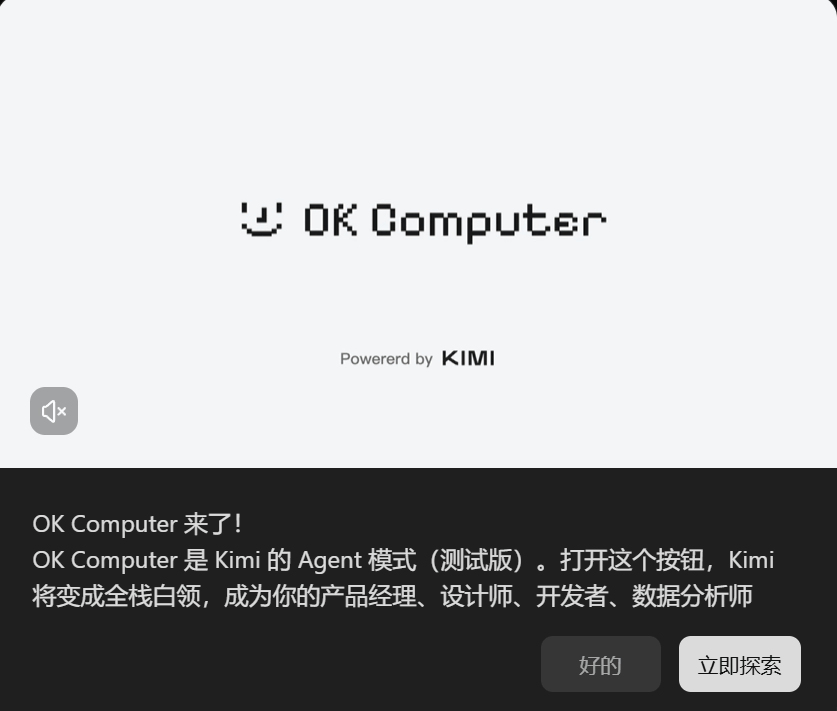
More than twenty years later, OK Computer has appeared again. This time, Kimi positions it as a full-stack white-collar worker, capable of searching, planning, and invoking tools. Users are responsible for proposing ideas, while OK Computer is responsible for producing reports, PPTs, apps, and web pages.
Sister K also got hands-on and tested it right away, putting OK Computer together with two very popular Agents on the market—Manus、Lovable —for a horizontal evaluation and comparison.
Next, let's actually feel their differences together.
01. Actual test cases
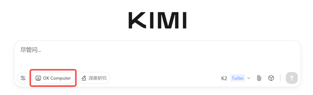
Friends with beta access will see the OK Computer button in the chat box on the Kimi homepage. Light it up to enable Kimi's latest Agent mode.
Official website:https://www.kimi.com
OK Computer, Manus, and Lovable, these three Agents actually represent different Agent models:
Kimi's OK Computer belongs to the vendor-type Agent. It is a first-party Agent product built by a large-model company itself, packing the K2 model's coding capabilities and the invocation capabilities of more than 20 tools into a complete experimental mode.
Manus and Lovable are third-party Agent products that rely on ready-made large models;
The difference is that Manus performs automated execution in a virtual browser, focusing on "running the entire process through";
Lovable takes a vertical route, focusing on "generating an MVP website in one sentence."
If the same task is given to them, who will complete it in a state closer to deliverable?
case1 Data analysis
Prompt: Please analyze Muji's business model and financial performance, covering revenue structure, profit margin, cost control, and market positioning.
FromYahoo Financeand other channels, obtain specific financial data to ensure all data is accurate.
Based on the analysis results, create a website that embodies Japanese Minimalism, with an overall style of clean whitespace and clear structure. The website needs to include rich and intuitive chart visualizations, using plotly to draw them (financial trends, comparative analysis, key indicators), accompanied by concise textual interpretation to ensure data-driven, professional, and credible content. Use icons appropriately to enhance clarity.
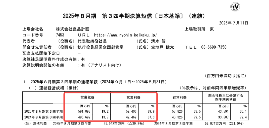
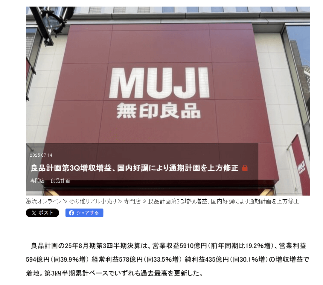
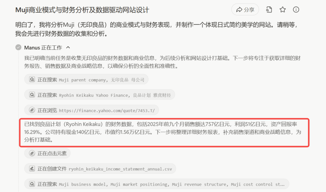
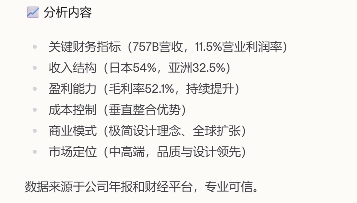
All three Agents found the financial data of Muji's parent company, Ryohin Keikaku Co., Ltd., but Sister K only discovered after careful inspection that their data was actually completely different.
First, look at OK Computer:
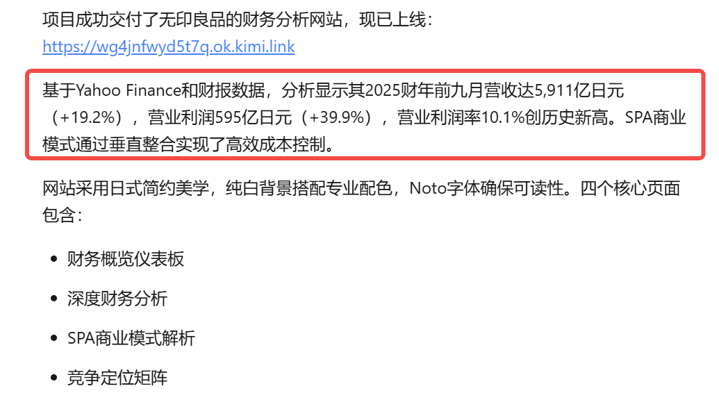
Sister K compared it with data online, and what was published on the official website and public media was basically consistent with OK Computer.
Data found by Manus:
Data from Lovable:
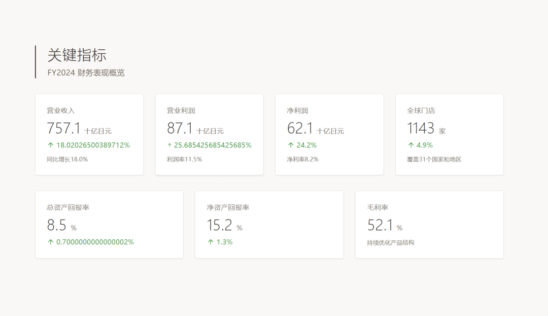
Lovable's report data is simply unbearable to look at. The unit of measurement is billions of yen? The ratios are accurate to more than a dozen decimal places... I'm speechless.
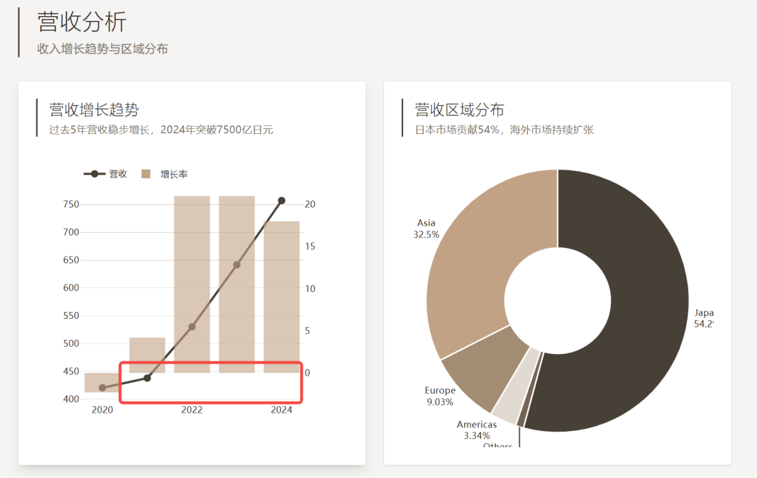
The bar chart wasn't drawn clearly either...
Manus directly provided textual analysis and a simple table.
OK Computer's charts are very rich, but the text content is relatively concise, possibly to improve the effectiveness of the visual presentation.
case2 Fitness plan
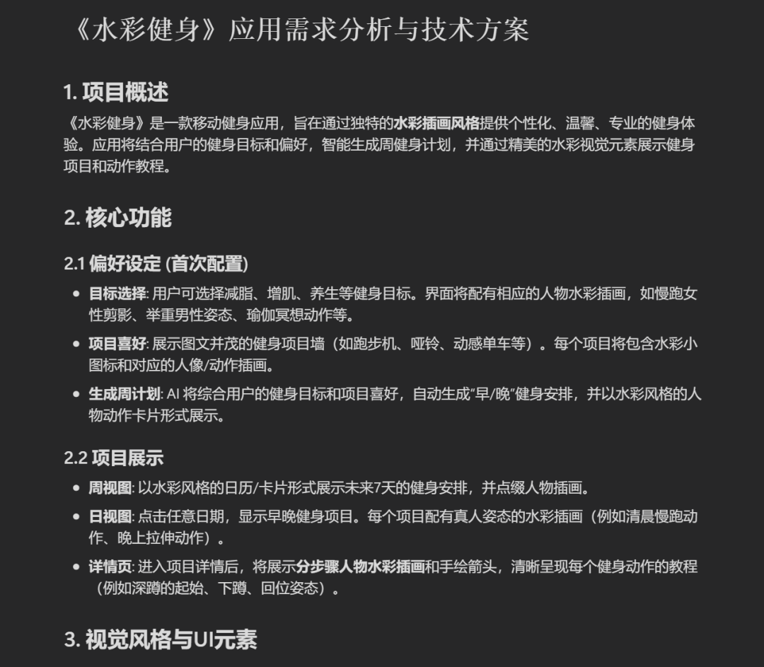
Prompt: Title: "Watercolor Fitness"
Core Features:
Preference Settings (First-Time Configuration):
Goal Selection: Users first choose their fitness goal (such as fat loss, muscle gain, wellness, etc.), and the interface is accompanied by corresponding watercolor illustrations of figures (such as: a silhouette of a woman jogging, a man's posture lifting weights, a yoga meditation pose).
Activity Preferences: Display a visual and text-rich activity wall (treadmill, dumbbells, spin bike, etc.). Each activity not only has a small icon, but is also paired with a corresponding portrait/movement illustration.
Generate Weekly Plan: The AI combines goals and preferences to automatically generate "morning / evening" fitness schedules, presented with watercolor-style figure movement cards.
Activity Display:
Weekly View: Use a watercolor-style calendar/card format to display the fitness schedule for the next 7 days, with figure illustrations as accents.
Daily View: Click any date to display morning and evening activities. Each activity is paired with a watercolor portrait pose illustration (for example, a morning jogging movement, an evening stretching movement).
Detail Page: Enter the activity details to display "step-by-step figure watercolor illustrations" + hand-drawn arrows, clearly presenting each fitness movement tutorial.
Visual Style:
Overall Style: A unified realistic watercolor illustration style, with a clean and warm interface, like a personal专属 fitness coach's notebook.
UI Elements: Buttons, fonts, and watercolor-style small icons maintain a consistent style.
Atmosphere: Personalized, warm, professional, with a touch of everyday life.
Illustration Requirements:
Cover Illustration: A person opening a fitness journal, surrounded by sports scenes (running, weightlifting, yoga), all as watercolor portraits.
Activity Selection Page:
Small icons (watercolor-painted dumbbells, bicycles, etc.) + portrait illustrations (a person lifting dumbbells, a person riding a bicycle).
Weekly Plan Page:
Each day's activity uses a "figure pose watercolor illustration" as the card's main visual (for example: Day 1 running portrait, Day 2 yoga portrait).
Daily View:
Display morning/evening exercise, using "realistic pose" watercolor illustrations (morning run / evening stretch).
Detail Page:
Step-by-step "movement tutorial watercolor illustrations", with complete figure poses (for example, squat: starting position → squat down → return).
Decorations:
Small leaves, hand-drawn arrows, and brushstroke backgrounds as accents.
UI Elements IV: All buttons, icons, and fonts maintain a watercolor style, ensuring an immersive and consistent style.
Interface Layout: Strictly designed according to mobile portrait proportions, with a simple and intuitive interaction flow.
Atmosphere Setting: Personalized, warm, professional, and full of everyday life.
After a round of analysis, Manus gave me a text-based design plan and summary.
But where is the website I wanted?
Now let's look at the comparison between Lovable and OK Computer:
(Lovable on the left, OK Computer on the right)
The page layouts are both pretty good, and the aesthetics are on point, but OK Computer's image generation ability feels stronger.
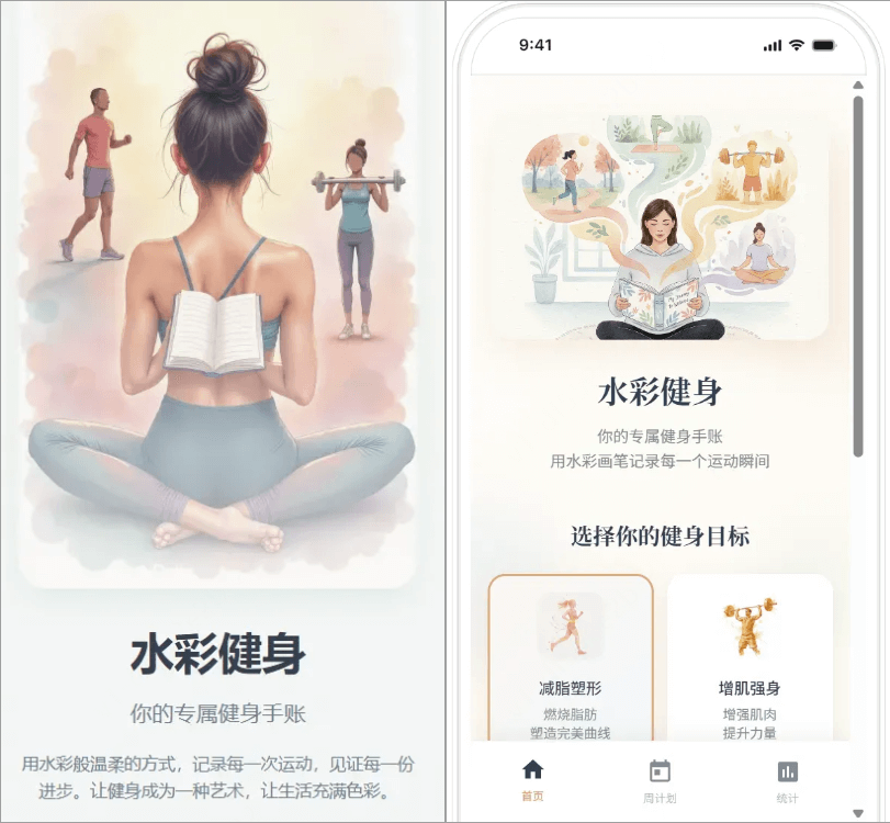
Functionally, they both implement the features of selecting fitness goals and activities to create a fitness plan. OK Computer also thoughtfully added a recharge function.
For the fitness movement tutorials on the detail page, Lovable did not display them at all. Although OK Computer made them, it only has a tutorial for one starting pose and does not adjust according to different activities, so there is still room for optimization.
case3 Clone the Douyin APP
Prompt: Clone the Douyin APP
After the task starts, OK Computer will first plan and first list a detailed Todo list, then search online for relevant materials, create a project outline, collect and generate assets... and display the current progress in real time during the process.
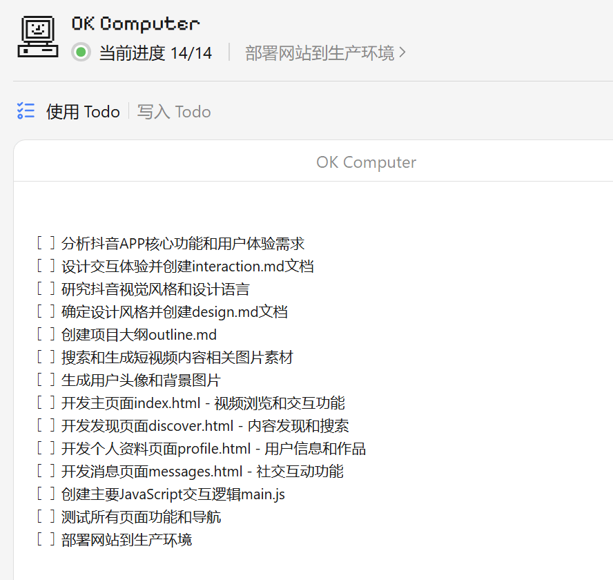
In about ten minutes or so, OK Computer completed the task of cloning the APP. The speed is still decent.
Let's compare the results of the 3 Agents:
At first glance, the overall layout of the APPs is pretty similar. The one whose homepage clone looks the most alike is Lovable, and it correctly displays the avatar position~
But the only page you can look at is the homepage... all the other pages in Lovable show as under development... it's basically a half-finished product.
The APPs made by OK Computer and Manus have relatively complete functionality.
For example, the discovery page made by Manus lets you keep scrolling videos, although the assets are slightly repetitive; the discovery page made by OK Computer not only has trending videos, but also includes trending topic recommendations, and it feels like it is pursuing completeness of functionality.
case4 Making a PPT
Prompt: Make a Chinese-style PPT.
Theme: A Study of Ghosts and Goblins in Liaozhai
Content elements: 6 selected"Strange Tales from a Chinese Studio"representative ghosts and goblins. Each ghost or goblin takes up 2 pages, including its ancient painting image, original text description, and a brief introduction to its abilities and moral significance.
Visual style: AI-generated Song Dynasty ink-wash landscape painting style, fused with the texture of antique rice paper. The composition is ethereal, with much use of negative space, vigorous brushstrokes, and colors mainly in burnt ink and light ink, with only light ochre or cinnabar used for local accents. Atmosphere setting:古朴典雅, mysterious and fantastical, with a scholarly air.
OK Computer still listed a detailed Todo list, searched online for materials, and generated related image assets.

The PPT generated by OK Computer:
The PPT generated by Lovable:
The PPT generated by Manus:
For this challenge, all three products performed well, especially OK Computer and Manus. The content is relatively rich, clearly explaining the ghost and goblin stories, the ghosts' and goblins' ability characteristics, background, moral significance, original text sources, and so on.
Lovable's image generation seems to have a bit of a bug. It actually drew a cartoon fox to make up the numbers...
Overall, when large model companies enter the field to build Agents, their advantages are very obvious.
First is speed. In my experience, OK Computer's generation speed is the fastest, most likely generated based on K2-Turbo.
Second is the completeness of development. Whether it's an APP, a webpage, or a PPT, although OK Computer also has imperfect areas, it basically achieves a balance between functionality and aesthetics.
By comparison, Manus can run the process to completion, but there aren't many surprises; Lovable is good at quickly producing a prototype, and it looks beautiful, but it cannot withstand scrutiny for complex tasks. Their highlights are not in the limits of their capabilities, but in identifying the segmented scenarios where they can exert their strengths.
02. Some sharing
The overall feeling after using it is that OK Computer really can complete a whole thing. Many things generated by Agents now are either unusable or have poor aesthetics. OK Computer should be hoping to widen the gap with other products in the direction of balancing both.
OK Computer is a good start. It shows that vendor-type Agents have more advantages and deliver better results.
Some people say Kimi has started charging, but in my view, charging itself is not scary. What's scary is being unable to make something worth paying for.
OK Computer has proven that the delivery standard for Agents is still on the rise.
In the future, anyone who wants to enter this track will have to face a question: can they live up to this standard in terms of experience, completeness, and even aesthetics?
Original link:Comparative review of Kimi OK Computer, Manus, and Lovable: How are vendor-type Agents different from third-party ones?