
What is ChartGen
ChartGen is an efficient and convenient AI chart generation tool, focused on quickly transforming raw data such as CSV and Excel into professional-grade data visualization results. Users only need to upload data and describe their requirements in natural language, and the AI can automatically understand the data structure, select the appropriate chart type, and generate high-quality charts. ChartGen supports 9 common chart types, including bar charts, line charts, pie charts, scatter plots, heatmaps, combo charts, waterfall charts, and funnel charts, making it suitable for various scenarios such as business analysis, operations analysis, market reporting, and academic research.
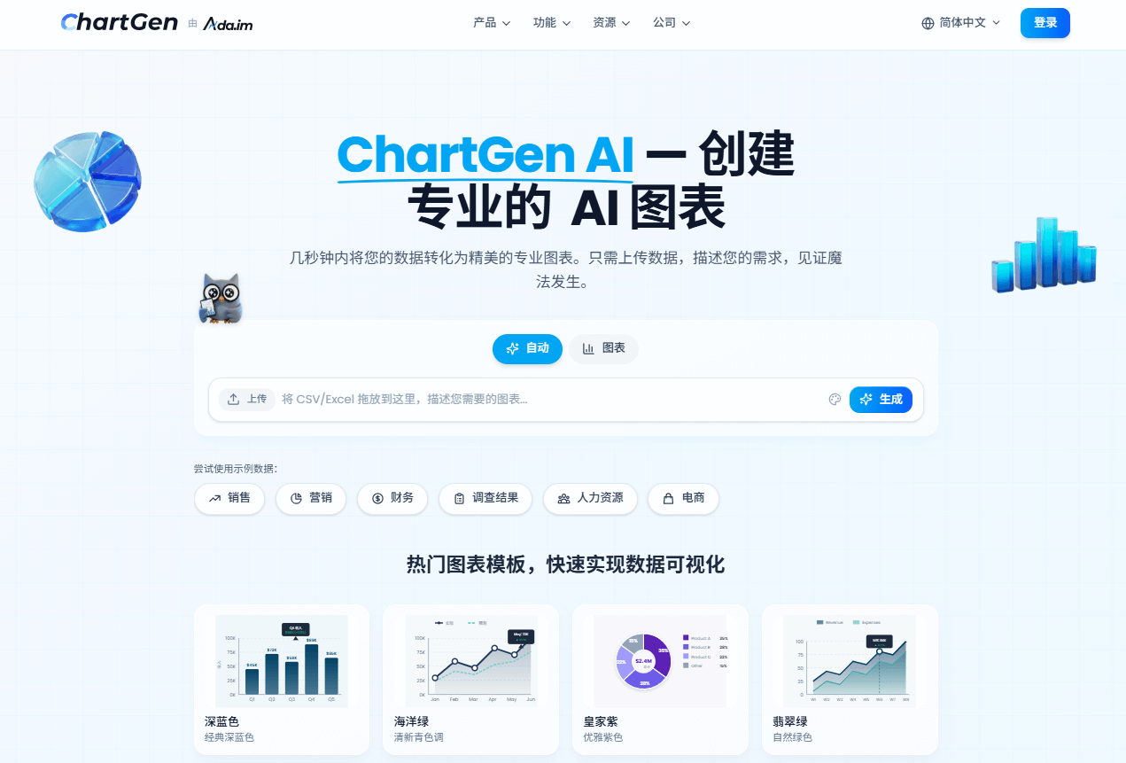
Main features of ChartGen
-
Quick chart generation: After users upload CSV or Excel data and describe their requirements in natural language, the AI can generate professional charts within 30 seconds, with no design or programming experience required.
-
Supports multiple chart types: Provides 9 common charts, including bar charts, line charts, pie charts, scatter plots, heatmaps, combo charts, waterfall charts, and funnel charts. The AI automatically recommends the most suitable chart type based on the data, and users can also switch manually.
-
Natural language interaction: Supports descriptions in Chinese and English. The AI can automatically identify data dimensions, metrics, and aggregation methods, and supports operations such as sum, average, and count.
-
Professional color schemes and customization: Built in 12 business-grade color themes. Users can customize colors to match brand visuals, and can also adjust details such as sorting, display quantity, and labels.
-
Multiple export methods: Supports exporting high-definition PNG images. The advanced version supports SVG, PDF, and embedded code, making it convenient for use in PPTs, reports, web pages, and dashboards.
-
Real-time data synchronization: After connecting to a data source, charts automatically refresh to ensure the real-time accuracy of the data.
How to use ChartGen
- Visit the platform: Visit the ChartGen official website https://chartgen.ai/ , register and log in to your account.
-
Upload data: Upload CSV or Excel files to ChartGen, or connect to a database or other data sources.
-
Describe requirements: Clearly describe the chart type you want to generate and your data presentation requirements in natural language (Chinese or English).
-
Generate charts: The AI automatically understands the data and generates professional charts, while also providing data insights.
-
Adjust and optimize: Adjust details such as chart type, color scheme, and sorting method as needed to achieve the best results.
-
Export and share: Export the generated charts in PNG, SVG, or PDF format, or embed code for use in PPTs, reports, or web pages.
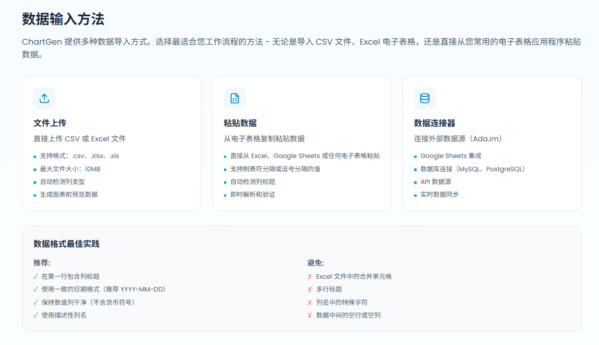
Core advantages of ChartGen
-
Instant generation: It takes only 30 seconds from data upload to chart generation, quickly meeting user needs.
-
Natural language interaction: Users describe their requirements in ordinary language, with no professional skills required to operate.
-
Multiple chart types: Supports 9 common charts, and the AI automatically recommends the most suitable chart type.
-
Professional color schemes and customization: Built in business-grade color schemes, with support for custom adjustments to meet personalized needs.
-
Multiple export formats: Supports export in PNG, SVG, PDF, and other formats, suitable for a variety of use cases.
-
Real-time data synchronization: After connecting to a data source, charts can update automatically, ensuring data timeliness.
-
Security and compliance: Complies with SOC 2 standards and uses end-to-end encryption to safeguard data security.
-
Efficient and easy to use: No design or programming experience required, suitable for all kinds of users to get started quickly.
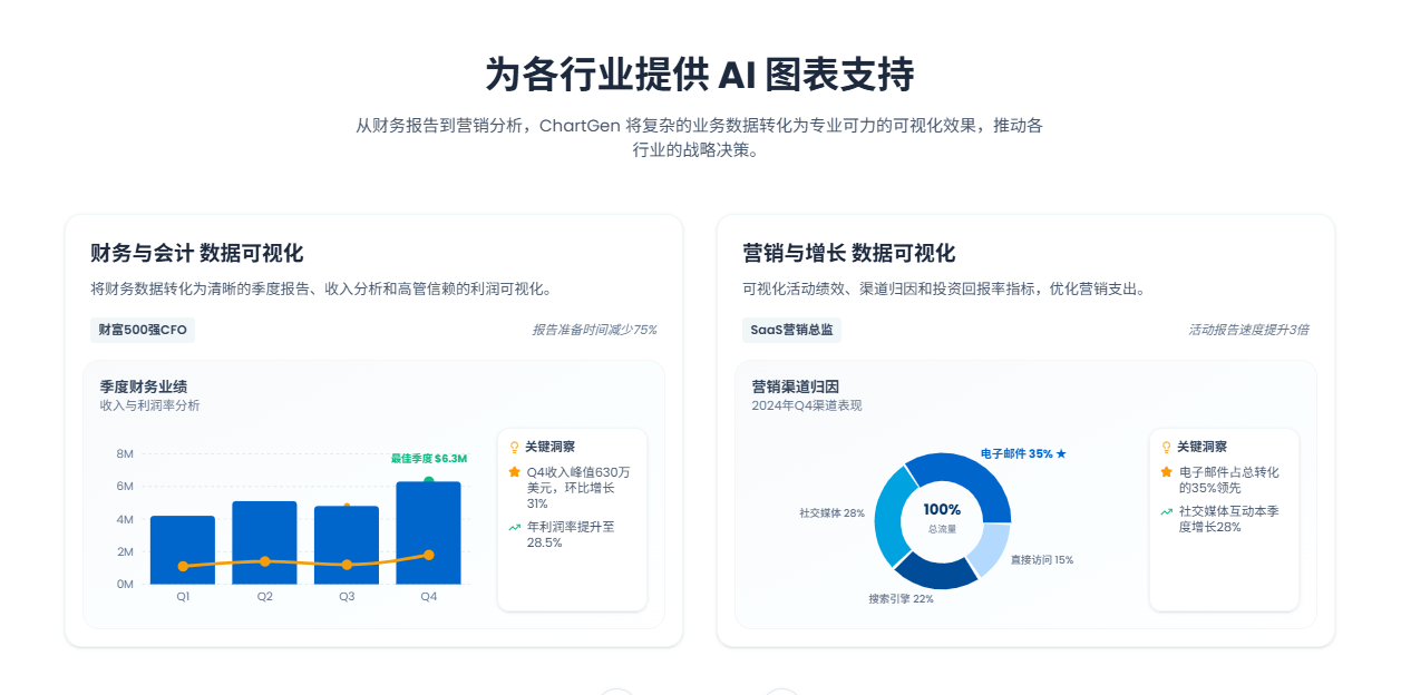
ChartGen use cases
-
Business analysis: Quickly generate charts for financial reports, sales trend analysis, market share, and more, helping management make data-driven decisions.
-
Operations analysis: Visualize key operational metrics, such as customer retention rate and order processing time, helping teams optimize business processes.
-
Marketing reporting: Present data such as marketing campaign performance, channel ROI, and brand influence to provide a basis for adjusting marketing strategies.
-
Academic research: Transform complex research data into intuitive charts for easy presentation of research results in papers and reports.
-
Product management: Analyze user behavior data, product usage rates, and more to assist product managers in product iteration and optimization.
-
Consulting reports: Generate professional charts for consulting projects, clearly presenting industry analysis, case studies, and more, enhancing the persuasiveness of reports.