
Friends in scientific research have probably all suffered from creating figures.
When writing a grant application, you draw the technical roadmap three times and still are not satisfied;the paperis submitted and gets sent back by the editor with a single line: "the graphical abstract does not meet the guidelines"; after finishing a differential expression analysis, you still have to spend a whole evening tweaking Python plotting code. In the past, if you wanted to make good figures, you either had to teach yourself drawing software like Illustrator and Inkscape, or pay someone to draw them for you, and then wait several days for a round of revisions.
In today's tutorial, I used SciDraw AI to actually test the three most commonly used scientific figure scenarios: NSFC technical roadmap, paper graphical abstract, and directly generating a volcano plot from Excel data. The entire process involves real operations and real screenshots, without using any official promotional materials.
SciDraw AI is an AI platform specifically for scientific figure creation, official website https://sci-draw.com,中文入口 https://sci-draw.com/zh。和通用 AI drawing toolUnlike others, it produces figures according to journal submission guidelines: white background, no unnecessary decoration, clear terminology labeling, and it also supports SVG vector export. The platform currently has 181 tools online, including 113 for scientific research and 59 for education. The interface supports Simplified Chinese, and payment supports Alipay. Registration gives 10 credits, and after that 5 free credits are given every day, which is basically enough to generate one figure for free each day.
Without further ado, let's look directly at the operation.
01. National Natural Science Technical Roadmap
First open the technical roadmap generator:https://sci-draw.com/zh/research-roadmap-maker
The tool provides four modes: general roadmap, technical roadmap (method logic), timeline schedule, and overall design for a thesis proposal. For writing a grant application, it is recommended to choose the second one. What it generates is a figure divided into columns by research content, and under each column you can attach technical methods and expected results, which is exactly the layout commonly used in applications.
Choose Simplified Chinese for the language, choose 16:9 for the aspect ratio, and then paste the research plan into the input box. Here is a tip: the more specific the description, the closer the generated figure is to the effect you want. What I entered is the following passage:
The description I entered:
A technical roadmap for a National Natural Science Foundation of China General Program project, with the research topic being the mechanism by which gut microbiota metabolites regulate the colorectal cancer immune microenvironment. It is divided into four research contents: 1. Clinical cohort sample collection and microbiota metagenomic sequencing; 2. Screening of key metabolites and in vitro functional validation; 3. Analysis of immune cell infiltration and signaling pathway mechanisms in mouse models; 4. Validation of intervention strategies and translational assessment. Represent it with a horizontal flow, mark the technical methods, expected results, and key milestones of each research content, and use an overall blue-green color scheme, suitable for direct inclusion in the main text of an application.
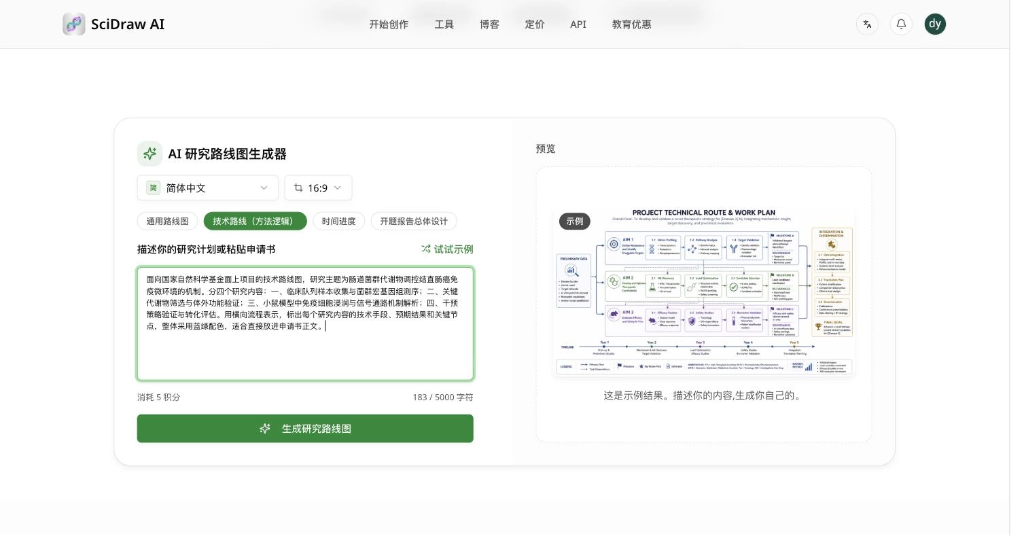
Select the "Technical Roadmap (Method Logic)" mode, paste the research plan into the input box, this time consuming 5 credits
Click "Generate Research Roadmap", and the page indicates it will take about 15 to 30 seconds.
Generating, and the preview area on the right shows progress
In actual testing, the figure was generated in just over twenty seconds. On the right, three buttons are directly provided: download, publication certificate, and open in editor.
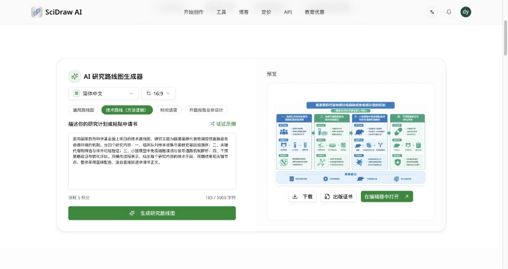
Generation complete, you can download it, or enter the editor to continue modifying it
Let's zoom in on the figure to see the effect:
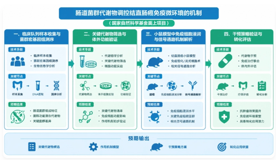
The actually generated NSFC technical roadmap, with four research contents in columns, each column containing technical methods, key milestones, and expected results
To be honest, this result exceeded my expectations. The four research content sections were automatically divided into four columns, and within each column they were expanded into three layers: "technical approach / key milestones / expected results," with a thoughtful line for "expected output" added at the bottom. There was not a single instance of garbled Chinese text in the entire figure, the color scheme strictly followed the blue-green plan I requested, and it even automatically annotated "National Natural Science Foundation of China General Program" below the title. It also holds up in the details: the sequencing column was paired with a DNA double helix and test tubes, and the animal experiment column had a mouse icon, both very much on topic.
This figure can basically go straight into the main body of the application without much issue; at most, just tweak a few sentences to match the wording of your own proposal.
02. Graphical Abstract for a Paper
The second scenario is a paper's graphical abstract (Graphical Abstract), entry point:https://sci-draw.com/zh/graphical-abstract-maker
There is one design choice on this page that I really like: at the top you can directly upload a paper PDF, and the AI will automatically read the content and draft a prompt. It does not matter if you do not have a PDF on hand; pasting in the abstract text works just as well.
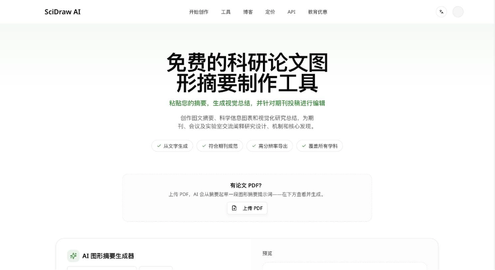
Graphical abstract generator, supports directly uploading a paper PDF to automatically draft a prompt
This time I directly pasted the abstract, and also added a sentence at the end about the layout structure I wanted, telling it what to place in each of the left, middle, and right sections:
The abstract + layout requirements I entered:
This study constructed a nanodelivery system responsive to the tumor microenvironment to improve the efficacy of immunotherapy for colorectal cancer. In vitro experiments showed that the drug release rate of this system increased to 78% under acidic conditions, and it significantly promoted dendritic cell maturation; in an orthotopic mouse tumor model, combined treatment with PD-1 antibody reduced tumor volume by 62%, and CD8+ T cell infiltration in tumor tissue increased 2.4-fold. The results suggest that this delivery system can enhance the efficacy of immune checkpoint inhibitors by remodeling the immune microenvironment. Please generate a graphical abstract with a horizontal workflow, with nanocarrier design on the left, in vitro and in vivo validation in the middle, and immune microenvironment remodeling results on the right, conforming to journal submission standards, with a simple color scheme.
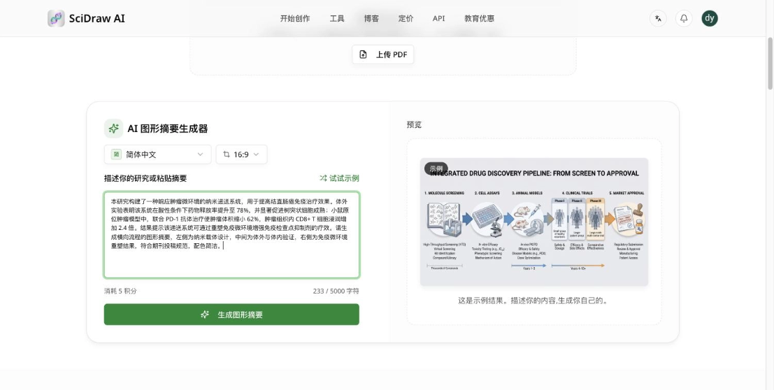
Paste the abstract and layout requirements together, also costing 5 credits
The figure came out after waiting about half a minute.
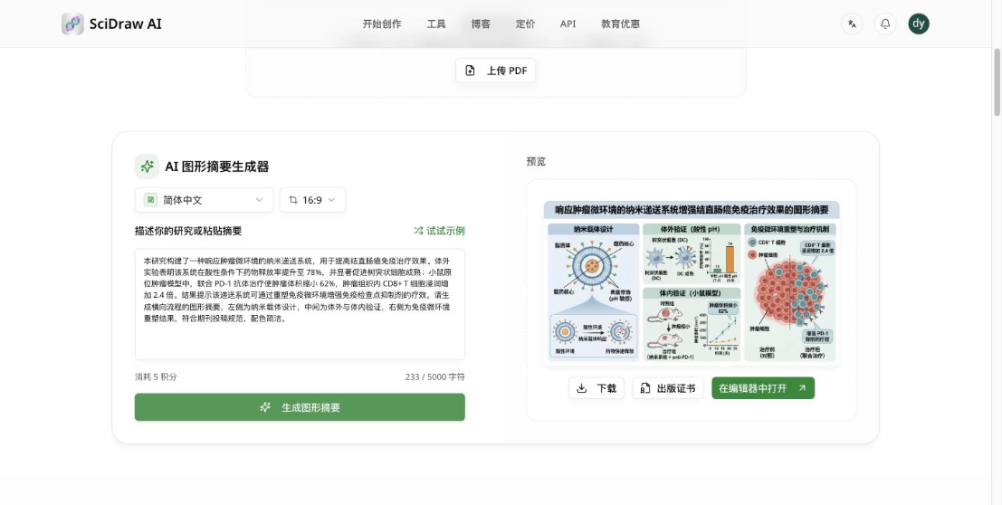
Graphical abstract generation completed
Zoom in to see the details:
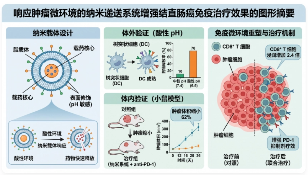
The actual generated graphical abstract, with left, middle, and right sections, and all the numbers from the abstract drawn into the figure
What surprised me most was that it drew every single number from the abstract into the figure, without missing any. On the left was the liposome structure and pH-sensitive surface modification; in the upper middle part it depicted dendritic cell maturation, with a bar chart beside it—neutral pH was 10, acidic pH was 78, exactly corresponding to "release rate increased to 78%" in the abstract; in the lower middle part was the mouse model, with a line graph of tumor volume over time, annotated "tumor volume reduced by 62%"; on the right, "CD8+ T cell infiltration increased 2.4-fold" was drawn as a comparison of tumor tissue before and after treatment.
In other words, it did not just pile up icons based on keywords; it truly understood the causal relationships in the abstract. This is a much better experience than I had before with general-purpose drawing models—general models often get the numbers wrong, or even skip drawing them altogether.
03. Using Excel Data to Make a Volcano Plot
The first two scenarios both generated schematic diagrams from text. The third one takes a different route—using real data to produce a statistical chart. Entry point:https://sci-draw.com/zh/volcano-plot-generator
The way this type of figure is drawn is completely different from the previous ones: it follows the platform's scientific research data visualization (Sci-Vis) route. After uploading a CSV or Excel file, the figure is generated by backend Python code, rather than letting the AI imagine and draw an image that "looks like a volcano plot."
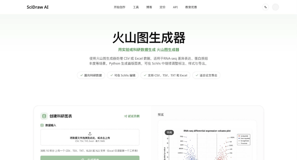
To save effort, I didn't organize my own data and directly clicked "Try Example" on the page, which loaded a 84-row, 5-column RNA-seq differential expression dataset. The page automatically expands a data preview, with column names in order: feature, log2_fold_change, p_value, adjusted_p_value, significance. This also tells you what format your own table should be prepared in. Next to it there is also a "Download Example Data" button; download it and fill it in accordingly.
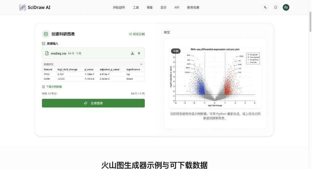
The volcano plot has been generated. You can download it, or go to SciVis to continue editing.
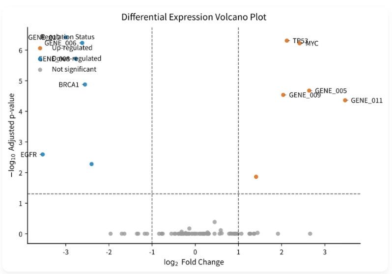
The actual generated volcano plot marks upregulated genes in red, downregulated genes in blue, and non-significant genes in gray, and automatically labels gene names.
The threshold lines, color grouping, and axis labels all follow the conventional way of drawing a volcano plot: upregulated in red, downregulated in blue, non-significant in gray, and significant genes are also automatically labeled with their names.
However, there is one small issue that needs to be made clear: the example data has only 84 rows, so the significant points are relatively concentrated, and the legend in the upper left corner overlaps with several gene labels. There are two solutions—click "Go to SciVis to continue editing" to enter the editor and manually move the labels away, or simply replace it with your own real data with several thousand rows, and once the points are spread out, it naturally won't be crowded. Either way, it is more practical than getting an image you cannot modify.
04. Some Sharing
After running through three scenarios, my feeling is very clear: scientific figure creation has indeed been changed by AI.
In the past, when drawing a technical roadmap, I had to first sort out the logic on paper, then go back to PPT to drag boxes and pull arrows. Font sizes wouldn't align, arrows were always crooked, and spending two or three hours on one figure was the norm. Now, as long as I clearly describe the research plan in Chinese, a version can be produced in just over twenty seconds. If I'm not satisfied, I can revise the description and try again, and each time it only costs 5 credits. The cost of revision is so low that I can freely trial and error, and this is the biggest change brought by AI.
A few practical suggestions, all learned from pitfalls this time:
- Write specific descriptions. For the same technical roadmap, just writing "technical roadmap of gut microbiota and colorectal cancer" is far inferior in output quality to clearly specifying the four research contents, color scheme, and layout.
- Decide the layout structure yourself. For the graphical abstract that time, I explicitly wrote "what goes on the left, what goes in the middle, and what goes on the right," and the resulting layout was arranged entirely according to my requirements. If you don't write it, the AI will arrange it itself, and it may not match the layout conventions of the target journal.
- Be sure to write numbers into the description. The 78%, 62%, and 2.4-fold in the abstract were drawn by it as bar charts and line charts; if you only write "significant effect," there will most likely be just one arrow in the figure.
- Use schematic diagrams and data charts separately. Mechanism diagrams, roadmaps, and abstract figures go through the first two text-generation entrances; statistical charts that depend on real numerical values, such as volcano plots, box plots, and heatmaps, go through the data visualization route. Don't let the image model make up data.
- Remember to export vectors before submission. The platform supports SVG and PPTX export, which can basically meet journals' requirements for vector formats and resolution. Submitting directly with a screenshot can easily be rejected. The platform also has tools such as PNG to SVG and image to vector, so old figures you already have can also be remedied.
Of course, it is not omnipotent either. For complex biological illustrations, such as a complete signaling pathway with a dozen proteins, it is difficult to get everything right in one generation, so you have to split it into several images, generate them separately, and then stitch them together; for particularly obscure experimental setups, AI may also draw something that looks plausible but is not, so you need to verify it yourself. So my approach is: let it produce the draft and layout, and keep the professional judgment for myself.
If you want to try it, just register directly on the official website: new users get 10 credits, and there are also 5 free credits every day. I suggest first running one image with your own project to see the actual results:https://sci-draw.com/zh
One final reminder: the official domain is sci-draw.com. There are many lookalike sites online with similar spellings, and accounts and works are not interoperable between them. Pay attention and verify when visiting, and do not mix them up.