
Last year, when I was building a personal brand website for myself, I hired a fairly well-known independent designer on ZCOOL, quoted at 30,000 yuan, with a delivery cycle of 6 weeks. I was quite satisfied when I got the draft. The first screen had a flowing Shader background, the Hero section had a video embedded, and the transition animations were as smooth as silk.
Until last night.
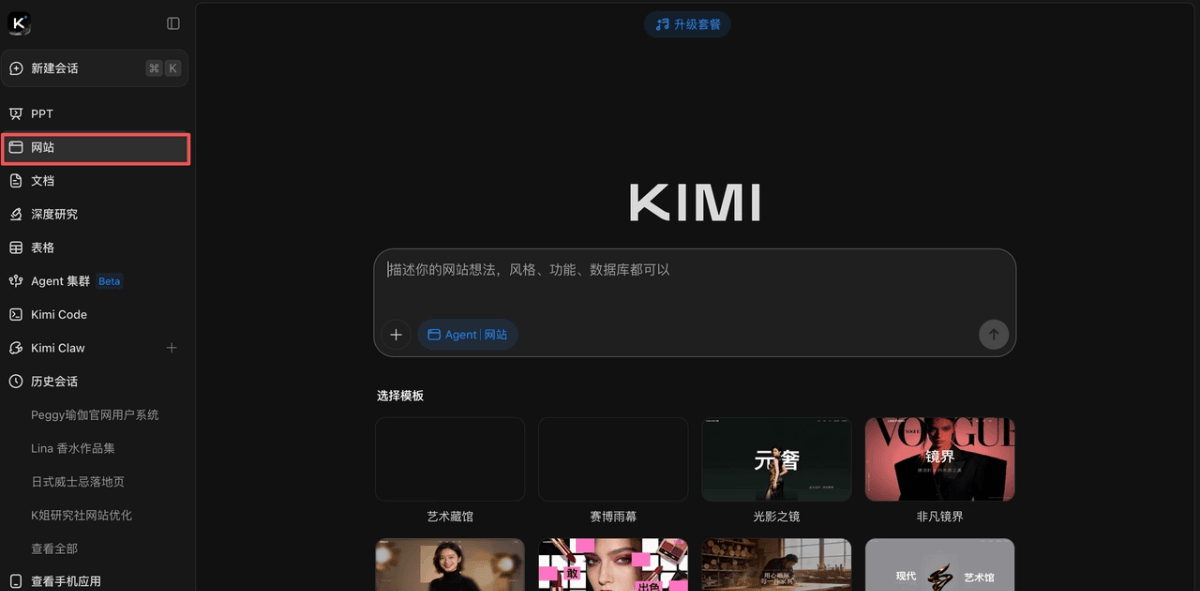
I saw that Kimi had updated K2.6and then I just threw one line of requirements at it.
5 minutes later, what it spat out was, compared with that 30,000-yuan draft,almost the same level。
In just one year, AI can do 30,000 yuan worth of work?
So in today's article, I'll help everyone put Kimi 2.6's real strength to the test. For all three cases, I ran them according to the standard that 'a client would really place an order.' The prompts are pasted below each case, so anyone who wants to copy the homework can take them directly.
01. Japanese Whisky Brand Landing Page
This case started because I have a friend who runs a craft beer product line and wanted to make a high-end product page. Previously, the outsourcing quote was 18,000 yuan.
I tried it with Kimi 2.6, and the positioning wasan independent Japanese whisky brand。
Below is the complete prompt:
Make a product landing page for an independent Japanese whisky brand.
Brand positioning: small-batch artisanal distillation, emphasizing craftsmanship and Eastern aesthetics.
[First Screen Hero Section]
- Use Three.js + GLSL Fragment Shader for the background to create a fluid effect:
* Simulate the visual of whisky slowly swirling in a glass
* Main color amber #C87533, mixed with dark brown #3B1F0E and golden highlights #E8B547
* Light source comes from the upper left, with obvious refraction and highlights
* The entire fluid slowly breathes (a 10-second loop)
- The Shader must include the following optical details:
Fresnel reflection - edge highlights
Subsurface scattering - light transmission inside the liquid
Caustics - ripple projection on the liquid surface
- Chromatic aberration - slight color dispersion at the edges of highlights Reference the texture of 'liquid gold'-related Shaders on shadertoy.com- Foreground left side brand name (vertical Japanese + horizontal English)
- On the right is a 3D whisky bottle, rendered with @react-three/fiber
* The bottle slowly rotates (one revolution every 30 seconds)
* When the scroll wheel scrolls, the liquid inside the bottle sways with inertia
* Fast scroll → small bubbles rise in the liquid
* Stationary → the liquid slowly returns to level
[Memorable Point: Ice Cube Cursor]
- When hovering over the whisky bottle or product card, the mouse turns into a floating 3D ice cube (transparent texture, with refraction effect)
- The ice cube has an extremely slight rotation (one revolution every 5 seconds)
- When leaving the product area, the cursor returns to default [Second Screen: Flavor Wheel]- Interactive circular flavor wheel, hover over different sectors:
* The sector glows
* A corresponding flavor's 'smoke' appears in the center (Shader simulation)
* The flavor description slides in from the right
* The background Shader color slightly adjusts to match (smoky → gray-blue, honey → golden yellow)
- A transition animation from the previous screen's Shader 'solidifying into the wheel'
[Third Screen: Brewing Process]
– Horizontal scrolling timeline, 5 steps: malt selection, fermentation, distillation, aging, bottling – one black-and-white craft photo per step + text description
[Fourth screen: Product series]
– 3 whisky product cards, each with a 3D bottle – on card hover, the bottle tilts slightly and the highlights change
[Fifth screen: Purchase section] – minimalist purchase button + quantity selector + long brand story text [Style references]
– For the overall feel, reference the restraint of the Yamazaki whisky official website
– For the vibe, blend the product presentation approach of the Saturnbird website (saturnbird.com)
– For typographic rhythm, reference the Linear website
[Tech stack] React 19 + TypeScript + Tailwind + Three.js + @react-three/fiber + @react-three/drei + GSAP
In this prompt, I didn't say “the Shader should look good”; instead, I directly specified several optics terms: Fresnel reflection, Subsurface scattering, Caustics, Chromatic aberration.
The model shifted gears as soon as it heard these words。
The Shaders generally generated by AI look like “dynamic gradients” because by default they follow the most basic rendering equation. Once you ask for Fresnel reflection + subsurface scattering, it calls on a more complete GLSL code structure. This is the core secret to producing a “real Shader.”
Let's take a look at the result.
Homepage Shader is a real Shader, not the kind of perfunctory CSS gradient. Amber liquid flows slowly across the screen, with Fresnel highlights at the edges, a sense of translucency inside, and caustic spots from ripple projections on the surface. Staring at it for five seconds makes you a bit dizzy—this is exactly the feeling I wanted of real liquor swirling in a glass.
The flavor wheel screen turned out pretty well too, with “smoke and background changing color in sync with the flavor.” This kind of breathing feel of a global color tone is something I've only seen on many award-winning foreign websites.
The brewing process screen is the one that “understands design” the most, and also the one that surprised me the most. I thought it would make me a conventional vertical timeline, but by default it gave me horizontal scrolling, contrasting with the vertical rhythm of the previous screens and instantly opening up the breathing feel of the whole page. The black-and-white craft photos are handled with restraint, without the cheap feel of stacked filters—this kind of detail is a bonus among bonuses.
There are flaws too. The 3D model really does eat performance on low-end machines; when I opened it on my 5-year-old MacBook Air, the fan took off. You can't dump all the blame on Kimi—complex Shaders plus high-precision 3D models are inherently heavy. But it didn't proactively implement performance degradation solutions, such as lowering the pixel ratio when a low-end device is detected, turning off high-cost effects like subsurface scattering, or simply falling back to a 2D display. In this regard, there is currently a certain gap compared with an experienced front-end developer.
02. Personal website of an independent perfumer
The setup I gave Kimi was: an independent perfumer named Lina, who studied in Kyoto for 8 years, with works themed around “Oriental herbs.”
I chose “perfumer” rather than the more common “photographer” because the identity of perfumer carries an Oriental aesthetic quality, is suitable for producing a “premium feel,” and better tests the level of Kimi2.6. The first thing in Vibe Coding is to give the model a protagonist specific enough to imagine, rather than empty words like “make a beautiful website.”
Below is the complete prompt I used; you can copy and paste it directly:
Help me make a personal portfolio website for an independent perfume perfumer.
Background: His name is Lina, she has studied perfumery in Kyoto for 8 years, and her works are themed around "Oriental Herbs."
[Hero section background on the first screen]
– Pure black background #0A0A0A
– A wisp of cinnabar-red smoke (#C9302C gradient to #8B1A1A) slowly rises from a position slightly left of center at the bottom of the frame
– As the smoke rises, it gradually spreads and fades, dissolving into faint cinnabar mist at the upper 2/3 of the frame
– The smoke has an extremely slight lateral drift (2-3px left-right sway), simulating airflow in a windless environment
– Cycle period 8 seconds; during the cycle, new smoke floats up from the bottom while old smoke dissipates at the top, ensuring the frame always has smoke
– The smoke is generated with Three.js + Fragment Shader (volumetric smoke shader, referencing "volumetric smoke" type works on shadertoy)
– An extremely fine film grain filter is overlaid on the whole thing, grain size 0.3px, density 15%
– In the bottom right corner there is an extremely faint orange-red glow (#8B1A1A, 20% opacity), hinting at the "incense burner" light source position
[Style reference]- Typography references the Linear official website (linear.app)
– Texture references the Awwwards 2025 award-winning Lando Norris official website (crafted by OFF+BRAND studio, searchable on awwwards.com)
– Vibe references brand official website works in the Zcool 2024 Top 100 Design List- Palette: primary color ink black #0A0A0A, warm off-white #F5F0E8, cinnabar red #C9302C
– Fonts: large headings Instrument Serif / Canela / Editorial New (choose the best), body text Inter / Söhne, decorative Chinese font uses "Source Han Serif"
[Memorable point: ink cursor]
– Hide the default mouse cursor and replace it with an ink dot that follows the movement
– When the mouse moves, it drags out an ink trail that slowly bleeds and fades- When hovering over clickable elements, the dot grows larger and the ink trail fades
– This effect should run through the entire site
[Page structure]
Hero first screen (full-screen video)
About section: text on the left, image on the right; the image is a black-and-white photo of her in the studio
Works section: perfume works display; cards use a clip-path reveal animation from left to right
Process section: a horizontal scrolling timeline of the perfumery process
Contact section: a minimalist appointment form
[Tech stack]
React 19 + TypeScript + Tailwind + GSAP + Three.js + @react-three/fiber + WebGL Shader
The video blending on the first screen was handled very meticulously. The flames in the background can clearly distinguish the inner flame from the outer flame, and when the cursor moves over, they dance according to the cursor's rhythm. This kind of detail is something my designer back then only did after I paid extra.
The ink cursor is the thing my friend reacted to first with "wait, what's going on with this mouse?" The default mouse is hidden and replaced with an ink line; as the mouse moves, it drags out an ink trail that slowly bleeds.
Of course it's not without flaws. In responsive mode on iPad portrait orientation, the video in the Hero section overflows a bit. I asked it to fix it, and it fixed it in the second round. What satisfies me is this single-point modification thing: it didn't "optimize" other places along with it. In the past, when I asked a certain model to change a button color, it would casually rewrite my entire navigation bar, and my blood pressure spiked on the spot.
03. Yoga teacher's booking system
The first two cases played with aesthetics. But this case plays with,this thing can really go live and make money。
Because I saw that K2.6's Agent this time not only upgraded the frontend, but also added backend functionality.
So I set up a very specific scenario:Peggy, an independent yoga teacher who has taught Yin Yoga in Bali for 10 years, needs a SaaS system that lets students book online.。
A full-stack app can't have all requirements thrown at it at once; it needs to be done in multiple rounds of dialogue. That way, the output of each round is verifiable, and the model won't get lost. I used 4 rounds.
Round 1: Build an aesthetically polished official website frontend
Help me build a personal official website for Peggy, an independent yoga teacher.
She has taught Yin Yoga in Bali for 10 years.
[Hero section]
– The Hero background is a looping video of seaside yoga at sunrise (use a placeholder for now)
– The main headline uses an elegant serif font and slowly fades in
– There is a CTA button "Book a Private Class" [Style references]
– For typography and restraint, reference the Linear website (linear.app)
– For atmosphere, reference Awwwards 2024 SOTY winner Igloo Inc (can be found on awwwards.com)
– Color palette: primary color off-white #F8F5F0, accent colors grass green #6B8E5A and terracotta #C68B6A
– Fonts: Instrument Serif for main headlines, Inter for body text
[Page structure]
- Hero section
- About section (Lina's story)
- Class introduction (three types of classes)
- Student testimonials
- Contact information
[Tech stack]
React 19 + TypeScript + Tailwind + shadcn/ui + GSAP. For now, only build the frontend page, don't build functionality.
After the first round, I was a bit surprised: the seaside sunrise Hero video, off-white primary color, and azure blue sea presented the restraint and relaxation a boutique yoga studio should have. Instrument Serif was chosen for the main headline, and the softness of the serif matched the vibe of "Yin Yoga." If I directly took a screenshot of this screen and posted it on Moments, probably no one would think it was made by AI.
Round 2: Add a user system
Very good. Now add a user system to this website:
– Students can register and log in with email
– Use Supabase for the backend
– After registration, there is a personal center page where they can see their avatar and booking records
– The login state must persist (not lost on refresh)
– The error messages on the registration form need animations (shake + red border)
The highlights of this round were the two details: persistent login state and form animations. It didn't just build the minimal "runnable" implementation, but considered real user scenarios by default: not getting logged out on refresh, error feedback with shake, and focus animations on input fields. It configured the Supabase environment variables entirely on its own; I never touched a single line of configuration code. I used to think "adding login" was something that required an hour in the IDE, but this round finished in 6 minutes, and the avatar and booking records area in the personal center were already there.
Round 3: Add a booking system
Continue.
Now add booking functionality:
– I offer 3 types of classes:
* One-on-one private class (¥800/session)
* Small group class (¥300/session)
* Trial class (¥0)
– Students can choose a date, time slot, and class type
– After a successful booking, write to the Supabase database
– The booking page needs a calendar component, and fully booked time slots turn gray and cannot be selected
[Memorable moment: the “lotus blooming” upon successful booking]
– After the student clicks “Confirm Booking,” it’s not a simple pop-up
– Instead:
* The entire screen dims
* A slowly blooming lotus appears in the center (SVG animation)
* Below the lotus, it displays “Your time has been reserved for you” + the specific date and time * There are faint falling petals in the background (particle effect)
* After 5 seconds, it automatically returns to the personal center
The first version that came out of the calendar component wasalready at a production-ready level.Fully booked time slots automatically gray out, unavailable states have tooltip hints, and the mobile time picker has been adapted separately. What made me want to replay the screen recording over and over the most was the “lotus blooming”: the screen dims, the lotus unfolds petal by petal with an SVG path animation, petal particles slowly drift down, and “Your time has been reserved for you” fades in. The whole process takes 4 seconds, but it pulls off the word “ritual.”
I wasn’t satisfied with the first version of the lotus blooming effect, so I asked Kimi to re-optimize only this part, and it really only changed this part, and it finished very quickly. This version is much better, right?
An AI that can do a “lotus blooming” and an AI that can only pop up “Booking Successful” are separated by ten designers.
Round Four: Add an Admin Backend
Finally, build the admin backend, where only the admin account can log in:
[Dashboard]
– Today’s bookings, this week’s revenue, new student count (with number rolling animations)
– “Today’s Energy Map” module:
* Displays the teacher’s course distribution today (timeline style)
* Each class is a dot, size = number of students, color = course type * Hover shows details - This month’s booking trend line chart (using recharts)
[Booking Management]
– A table displays all bookings, which can be filtered and canceled
– Style references the Linear official website product interface (linear.app) [Student Management]
– List of all registered students [Overall Style]
– Built with shadcn/ui
– Table design references Linear’s Issue list view
The Admin backend is the screen in this entire Case that made me feel the most that “the level has changed.” It didn’t cut corners on the non-standard “Today’s Energy Map” component: dot size corresponds to student count, color corresponds to course type, and the hover overlay shows details. Combined with the recharts line chart and number rolling animations, this backend’s information density and granularityare already close to the serious SaaS products I use every day。
The last step, and the most critical one:
Help me deploy this app to Vercel and give me a URL I can actually visit.
Deploy the frontend to Vercel, use Supabase as the backend service, and configure the environment variables properly.
More than ten minutes later, I had these things:
Frontend official website + student registration and login + course booking system + admin backend + data visualization + a real database + a real, accessible online URL.
04. Some Sharing
After testing these three Cases, I feel that Kimi 2.6’s aesthetics has really moved up a level. Top designers don’t need to worry for now,but the middle 90% of the outsourcing market really should tremble a bit。
Also,the full-stack thing is even more imaginative than aestheticsBecause aesthetics are the icing on the cake, while full-stack is from 0 to 1. Previously with Vibe Coding, what you got was a beautiful shell. Now with Vibe Coding, you can get a business that can take payments, capture leads, and be operated. A yoga teacher no longer has to spend 20,000 to hire an outsourcing company to build a booking system, and a coffee shop owner no longer has to spend 10,000 to build a brand website. This is far more important than "model benchmark scores".
Finally, frankly speaking, on the aesthetics front, Kimi has indeed reached the first tier at present. In cases with high frontend complexity, the stability of Shader and 3D effects is better than I expected.
A few years ago when we talked about AI, we talked about "whether it can do it." Last year when we talked about AI, we talked about "whether it does it like a human." Now when we talk about models like Kimi 2.6, what we are talking about is "whether the aesthetics are high-end enough."The change in evaluation dimensions itself shows the progress of AI。
AI has begun to compete with humans for the territory of "taste."
Original link:K2.6 small update, great leap forward! In actual testing, it surpassed the webpage I spent 30,000 to have a designer make