
Today I'm sharing something suitable for web design.
Usually when we have Cursor, Claude Code, Codex, and other Agents build pages, we often run into a problem: we tell the AI what style of page we want to replicate, but the result is always only slightly similar and doesn't match our expectations at all.
So today I'd like to recommend a project on GitHub called: Awesome-design-md, specifically for replicating the web styles of well-known products.
01. Project Overview
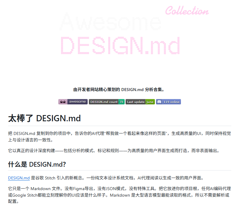
Awesome-design-md is essentially a collection of AI-readable design specifications.
Project address:https://github.com/VoltAgent/awesome-design-md
Awesome-design-md includes the design languages of 73 well-known product websites, such as: Claude, xAI, Ollama, Cursor, Notion, Figma, Apple.
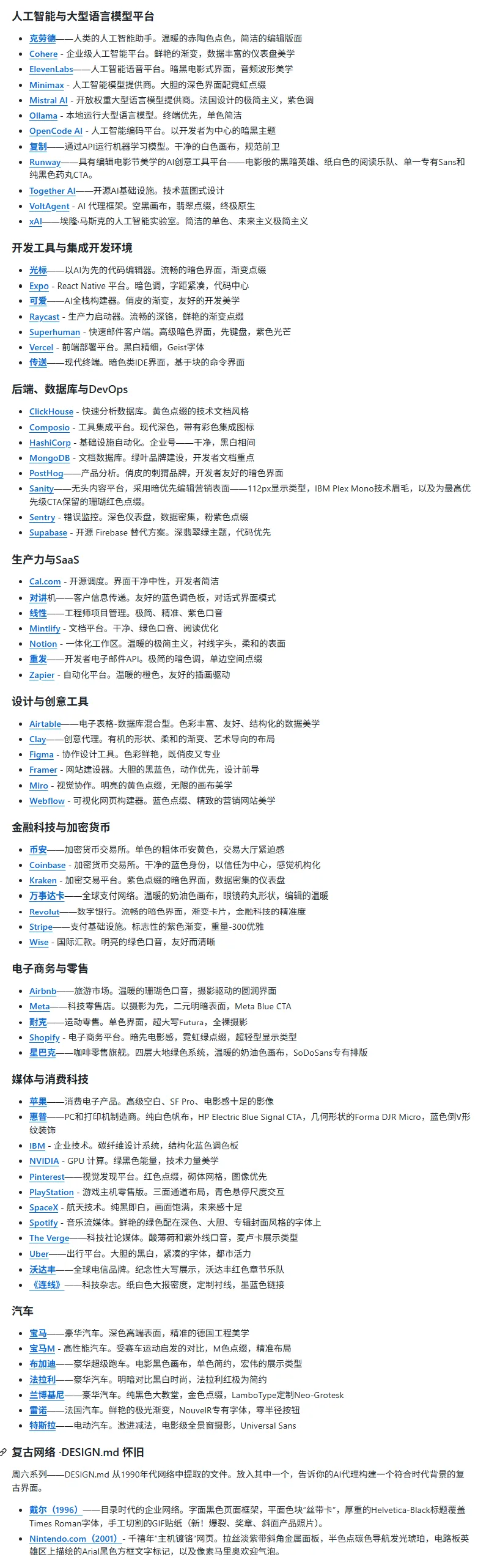
Each brand's DESIGN.md usually covers:
-
Brand character and visual principles
-
Primary color, secondary color, background color, semantic color
-
Font, font size, font weight, line height
-
Spacing, border radius, shadows, layout rules
-
How to write components such as buttons, cards, input boxes, sidebars
-
Motion effects, interaction feedback, content tone
-
CSS / Tailwind references for front-end implementation
02. Hands-on Test of the Project
The usage is very simple. After downloading the repository, open the design-md directory, choose the DESIGN.md of the target product you want to replicate, and paste it into the rules file of tools such as Cursor,Claude Code , etc.
If you have downloaded it into your project folder, you can also directly say in the prompt whose DESIGN.md you want to use.
case 1 Claude-style replication
Prompt: Please read the Claude DESIGN.md in the Awesome-design-md project, and build an AI writing tool homepage according to Claude's design language. Product name: Document Partner. The page needs to include: 1. Hero section: product name, short tagline, text input box, primary CTA, secondary CTA. 2. Product preview: rewriting results, tone settings, title candidates, version status. 3. Feature modules: article rewriting, title generation, tone adjustment, batch processing. 4. Usage flow: paste draft, choose goal, generate version, human confirmation. 5. Target users: WeChat official account authors, product managers, operations teams, independent developers. 6. Get started section: input example, submit CTA.
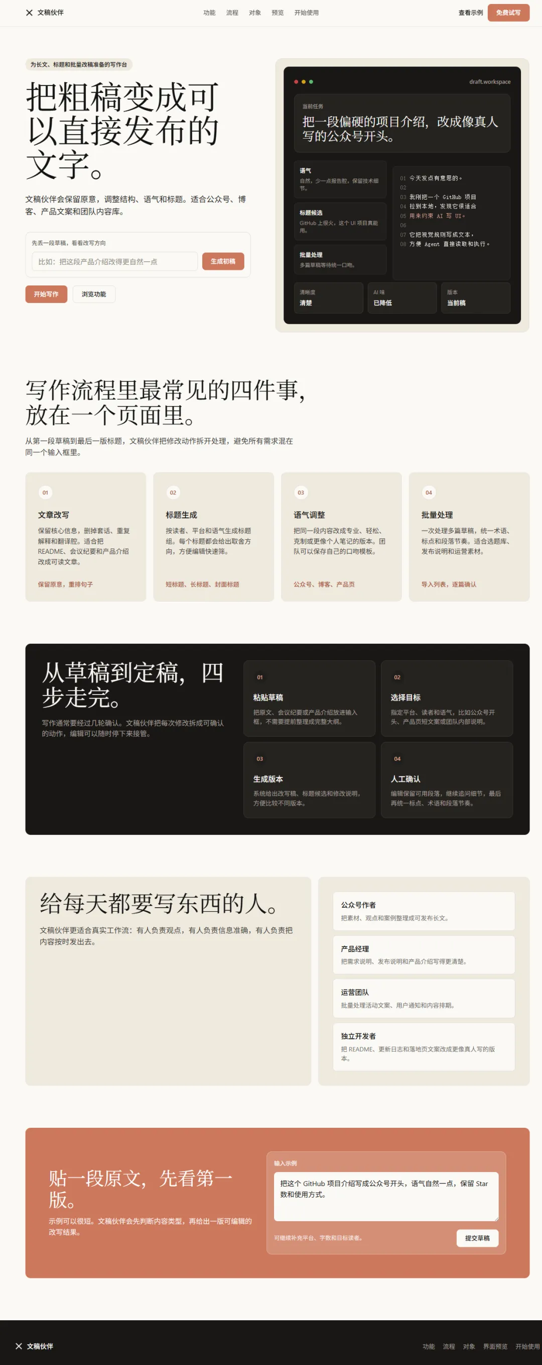
Claude's warm beige, coral CTA, quiet typography, and dark product preview are all quite similar, but the product preview is not as attractive as Claude's.
case 2 Notion-style replication
Prompt: Please read the Notion DESIGN.md in the Awesome-design-md project, and build a team knowledge base homepage according to Notion's design language. Product name: NoteRoom. The page needs to include: 1. Left navigation: workspace, team space, project documents, favorites. 2. Top area: search box, new document entry, member entry. 3. Recently edited documents: document title, author, update time. 4. Team space: product, R&D, operations, marketing. 5. Favorite documents: common templates, meeting notes, release plans. 6. Empty state: prompt and new document entry when there are no documents yet.
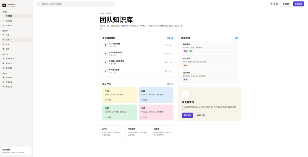
It really looks like a mature tool homepage. The left navigation, top search, recent documents, team space, favorite documents, and empty state all look like a real knowledge base homepage. Notion's gray-white interface, light borders, low contrast, and colored space blocks are handled naturally.
case 3 Apple-style replication
Prompt: Please read Apple DESIGN.md in the Awesome-design-md project, and create a high-end AI hardware product homepage following Apple's design language. Product name:Auralink. The page needs to include: 1. Hero section: product name, short tagline, primary CTA, secondary CTA, product showcase area. 2. Product highlights: showcase 3 to 4 core selling points. 3. Performance specs: chip, battery life, connectivity, weight. 4. Use scenarios: office, commute, creation, meetings. 5. System ecosystem: phone, computer, earphones, cloud sync. 6. Purchase section: price, color selection, purchase CTA.
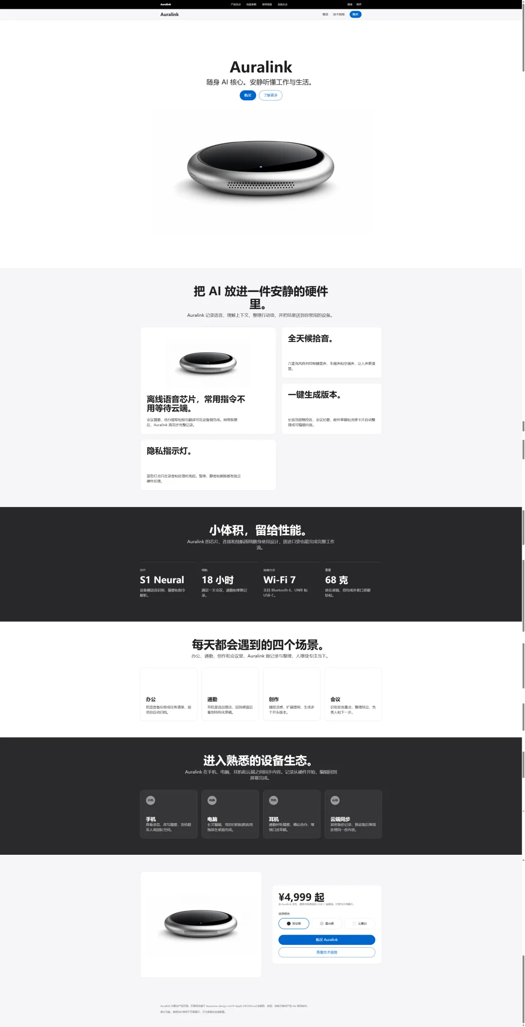
This is the one I think looks the most similar; I even thought Apple had released a new product. Apple's two-tier navigation, massive whitespace, product photography priority, and purchase configuration area are all done.
case 4 Nike style recreation
Prompt: Please read Nike DESIGN.md in the Awesome-design-md project, and create a sneaker product detail page following Nike's design language. Product name:AeroRun 01. The page needs to include: 1. Hero section: product name, short tagline, large product image, price, primary CTA, secondary CTA. 2. Product selection: color selection, size selection, quantity selection. 3. Product features: cushioning, breathability, traction, lightweight. 4. Sports scenarios: running, training, everyday wear. 5. Recommended pairings: tops, shorts, socks, backpacks. 6. Purchase section: stock status, delivery information, add-to-cart CTA.
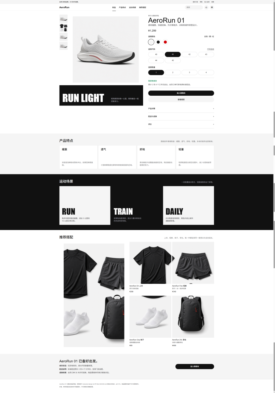
The large product image, thumbnail rail, right-side purchase panel, black pill CTA, Soft Cloud background, and size/color/quantity selection are all on point. If you want it to feel even more Nike, you could add a sports scene photo to strengthen the contrast of "product detail + sports blockbuster."
case 5 Ferrari style recreation
Prompt: Please read Ferrari DESIGN.md in the Awesome-design-md project, and create a high-performance AI Agent product launch page following Ferrari's design language. Product name: Rosso Agent. The page needs to include: 1. Hero section: product name, short subtitle, primary CTA, secondary CTA, product visual area. 2. Speed capabilities: showcase task response, concurrent processing, automatic execution. 3. Automated tasks: email, spreadsheets, web operations, code tasks. 4. Precision control: permission settings, task replay, human confirmation. 5. Security mechanisms: logs, approvals, data isolation. 6. Launch CTA: apply for trial, view demo.
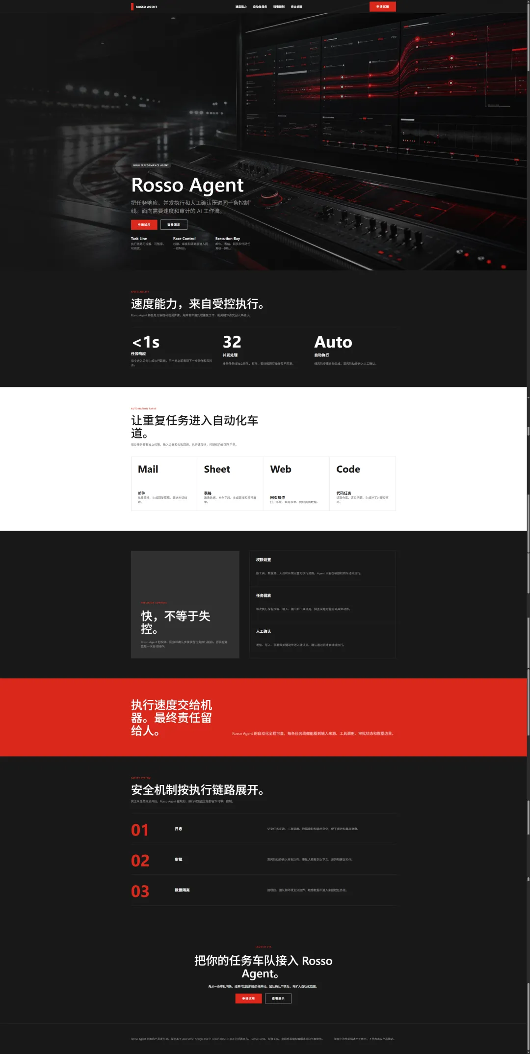
Among the five, this has the most impactful brand translation. The near-black canvas, Rosso Corsa, sharp-angled CTA, cinematic hero section, red execution line, and console visuals all fit Ferrari very well; the hero visual is very strong.
03. Dig a little
In the Stack Overflow 2025 Developer Survey, 84% of respondents are already using or planning to use AI tools for development, but the same survey also mentions that 66% of developers have encountered the problem that "AI-generated results are just a little off."
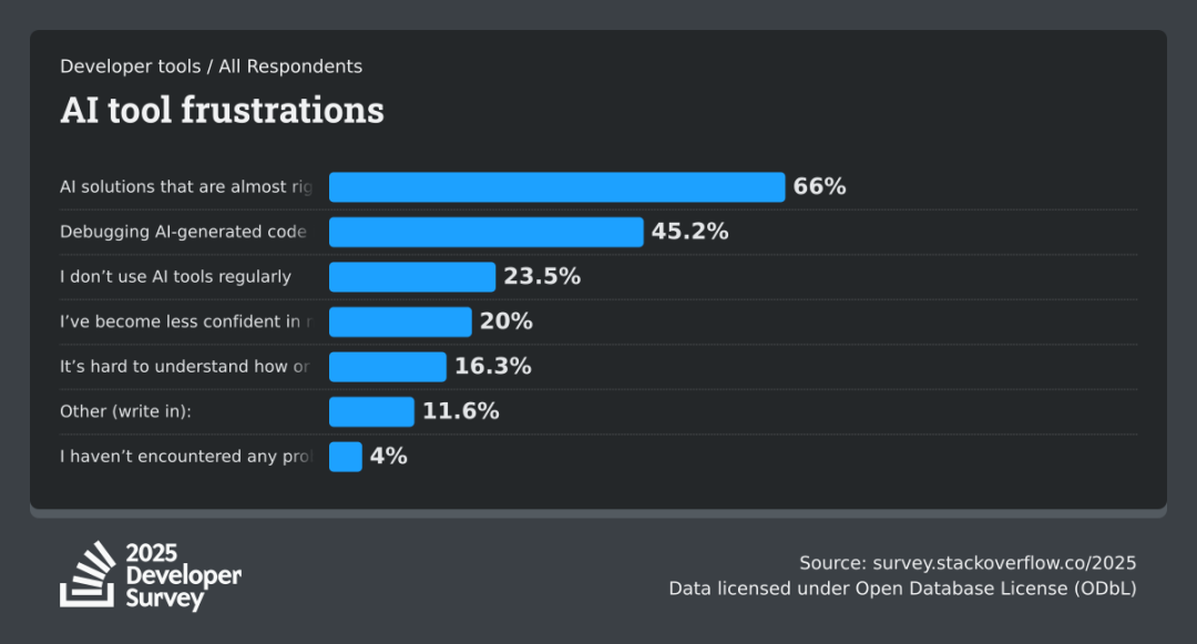
This data fits my previous experience very well: pages can be generated, but they often only look about a third similar.
This is where the value of Awesome-design-md shows. Awesome-design-md organizes the design judgments of well-known product web pages, such as colors, fonts, spacing, components, layouts, and interaction rules, into DESIGN.md that Agents can understand. It lets you directly recreate pages with an extremely high similarity.
Awesome-design-md solves the most time-consuming part of AI front-end generation: repeatedly describing the style, repeatedly changing the visuals, and repeatedly telling the Agent "it's not similar." It lets you build a decent MVP faster, reduces first-draft rework, and takes a big step toward a real product.
Original link:GitHub hits 93K stars, recreating the web style of well-known products with one click