
What Is Astryx
Astryx is Meta's open source React design system, currently in Beta. The system is built on React and StyleX, offering 150+ accessible components, brand-level theming, dark mode, ready-to-use templates, and a CLI toolset. Developers do not need additional build plugins; they can simply import the precompiled CSS and reference type-supported React components to quickly build interfaces. The component source code is fully open, supporting deep customization.
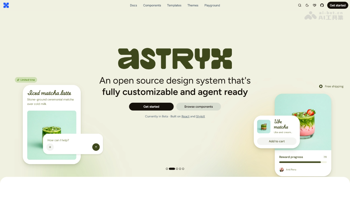
Astryx's Main Features
-
150+ Accessible Components: Covers common UI elements such as buttons, forms, navigation, and data display, all with built-in accessibility support.
-
Brand-Level Theming System: Implemented based on CSS custom properties, allowing designers to directly adjust variables to create a unique brand style.
-
Native Dark Mode Support: Built-in light/dark theme switching capability, adaptable without additional configuration.
-
Ready-to-Use Templates: Provides preset page templates to accelerate the development process from prototype to production.
-
CLI Toolset: Provides command-line tools to assist with project initialization, component installation, and theme management.
-
Fully Open Source Code: The internal structure of components is transparent, supporting direct injection of source code into projects via swizzle.

Follow WeChat and reply "Open Source" to join theAI Open Source Project Exchange Group
How to Use Astryx
-
Install Dependencies: Install the Astryx core package and required components via npm/yarn.
-
Import Precompiled CSS: Import the global stylesheet at the application entry point, with no additional build plugin configuration required.
-
Reference React Components: Directly import type-supported components and use them in JSX.
-
Configure Theme Variables: Override default design tokens via CSS custom properties to achieve brand customization.
-
Deep Customization (Optional): Use the CLI's swizzle command to inject component source code into the project and modify internal logic as needed.
Astryx's Core Advantages
-
Zero Build Plugins: The precompiled CSS approach makes integration extremely low-cost, with no need to modify existing build processes.
-
No Style Lock-In: Supports overriding styles through any tech stack such as Tailwind and CSS Modules, with no vendor lock-in.
-
Designer-Friendly: Theming is based on CSS variables, so designers can adjust the visual style without forking code or wrapping components.
-
Source-Level Openness: Components are fully transparent, and the swizzle mechanism meets full-scenario needs from simple usage to deep customization.
-
Meta-Level Engineering Validation: Refined through 8 years of large-scale internal application, with guaranteed stability and accessibility.
Astryx's Project Address
- Project Official Website:https://astryx.atmeta.com/
- GitHub Repository:https://github.com/facebook/astryx
Comparison of Astryx and Similar Competitors
| Comparison Dimension | Astryx (Meta) | Ant Design (Alibaba) |
|---|---|---|
| Company | Meta | Alibaba |
| Tech Stack | React + StyleX | React + Less/CSS-in-JS |
| Number of Components | 150+ | 60+ base components + rich business components |
| Theming mechanism | CSS custom properties, switchable at runtime | Less variables + ConfigProvider, requires compilation |
| Style overrides | Does not lock in a tech stack; Tailwind/CSS Modules are both fine | Mainly relies on Less variables and CSS overrides |
| Source code openness | Fully open, supports swizzle injection of source code | Open source but internal implementation is encapsulated; requires forking to modify |
| Build requirements | No additional build plugins needed; just import the precompiled CSS | Usually requires configuring on-demand loading and theme compilation |
| Dark mode | Natively built in | Needs to be configured via ConfigProvider |
| Ecosystem positioning | Design system + engineering toolset | Enterprise-grade mid- and back-office UI solution |
| Accessibility | Built-in accessibility support | Built-in accessibility support |
Application scenarios for Astryx
-
Enterprise-grade mid- and back-office systems: quickly build complex business interfaces such as admin dashboards, data dashboards, and configuration pages.
-
Brand official websites and marketing pages: use the flexible theming system to quickly match corporate brand visual guidelines.
-
Design system migration: as a foundational layer, help teams smoothly migrate from legacy tech stacks to the modern React ecosystem.
-
Low-code/no-code platforms: provide standardized components and theming capabilities to support the UI rendering layer of visual building tools.
-
Open-source product interfaces: provide open-source projects with a component library that is ready to use, visually consistent, and easy to customize.