
First time here? If
iblai.envhas noARCHITECTURE=, run/iblai-vibe-startfirst (four questions; two minutes) — it decides single-org / multi-org / headless and who signs in, and every skill reads the answer.
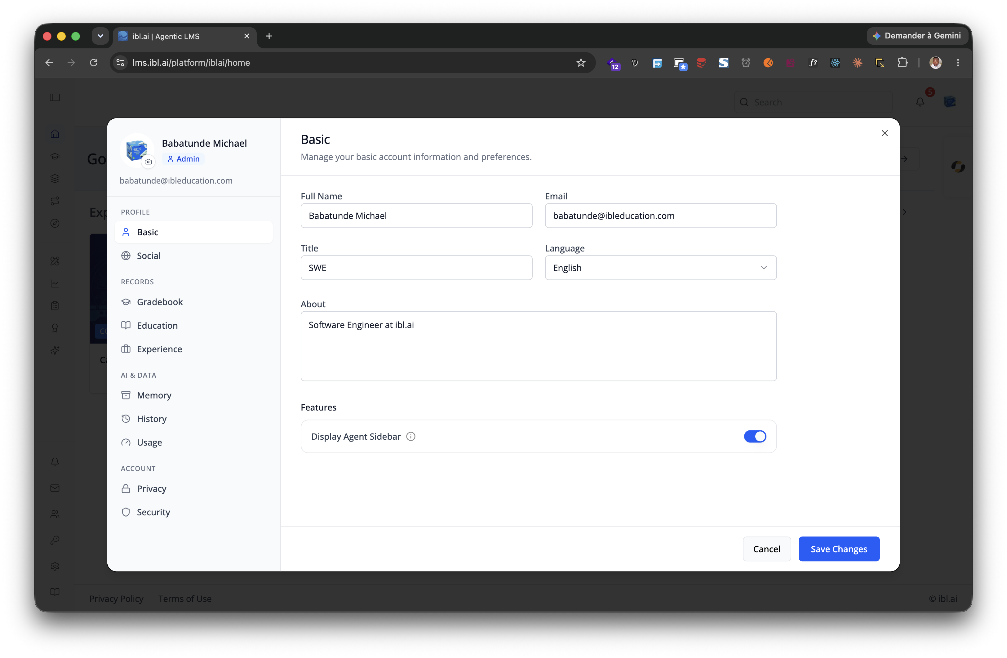
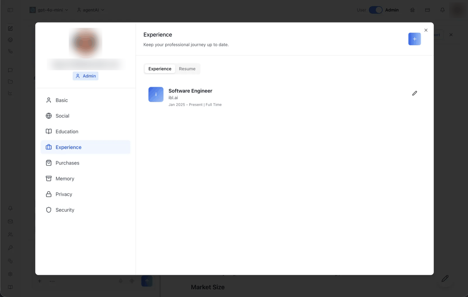
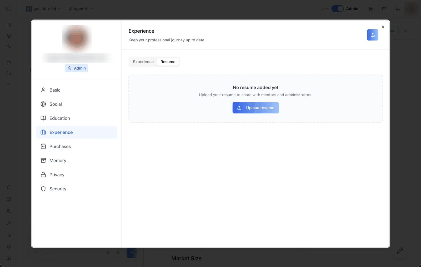
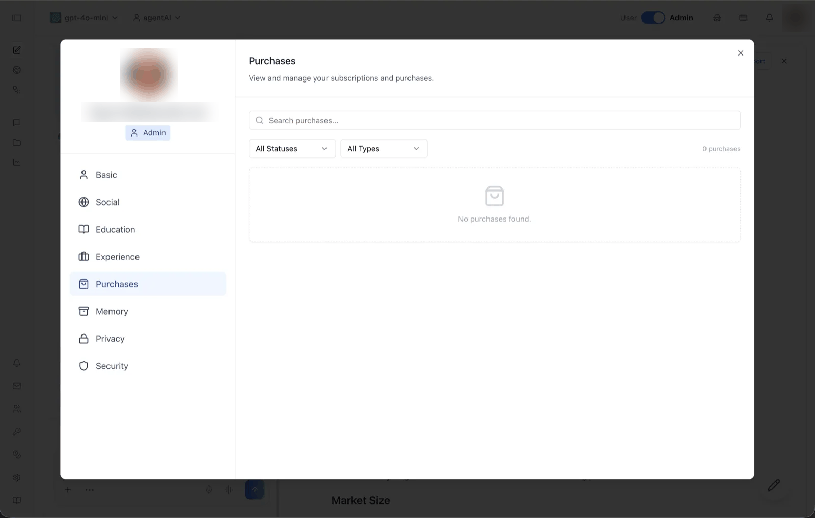
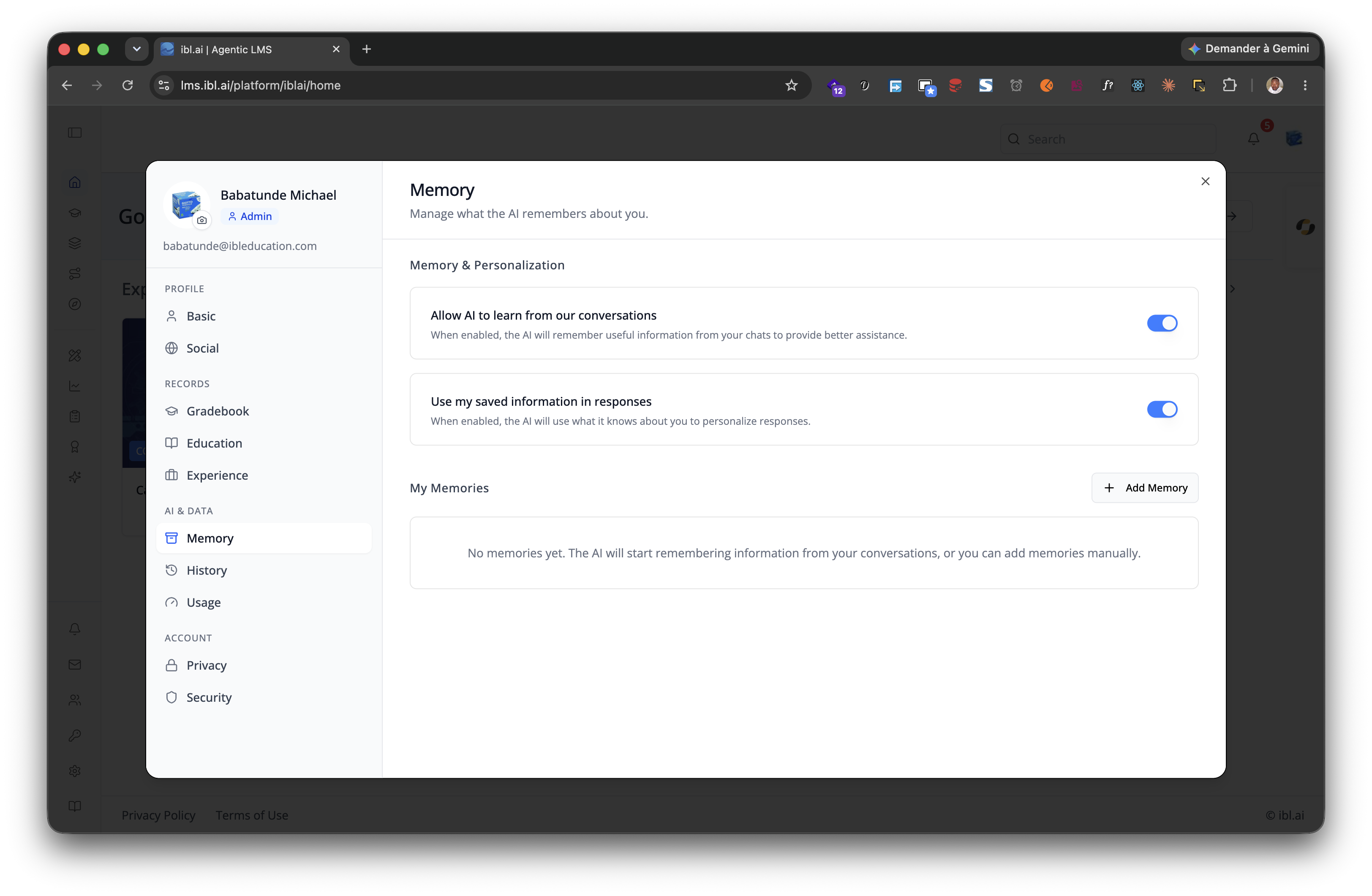
Add user profile features -- a compact avatar dropdown for your navbar and a full settings page whose sidebar groups its tabs under four headings: Profile (Basic, Social), Records (Gradebook, Education with Credentials and Skills sub-tabs, Experience with a Resume sub-tab, Purchases), AI & data (Memory, History, Usage) and Account (Privacy, Security, Advanced) — several of them feature-gated per organization (see the tab table below).

Template: the dropdown this skill creates is bundled as
assets/profile-dropdown.tsx.j2. See/iblai-vibe-scaffoldfor the{{ }}contract.
Navbar: If the user wants a navbar with the profile dropdown, guide them to
/iblai-vibe-navbarfirst. That skill creates the full navbar with logo, page links, notification bell, and profile dropdown.
Common setup (brand, conventions, env files, verification): see docs/skill-setup.md.
Step 0: Start from vibe-starter? (new projects)
Before running this skill, ask the user:
Are you starting a new project from scratch? vibe-starter (https://github.com/iblai/vibe/tree/main/skills/start/iblai-vibe-ops-init/assets/vibe-starter) already ships the profile dropdown and /profile page wired up, alongside auth, navbar, and account/notifications. Want to use that instead?
If yes, copy the bundled starter template from the installed
iblai-vibe-ops-init skill's assets/vibe-starter/ directory (it sits
alongside this skill in your skills directory; in the vibe repo it lives
under skills/start/), or fetch it from the vibe repo if those assets
are not installed -- tell the user which path you took -- then skip this
skill:
cp -a <skills-dir>/iblai-vibe-ops-init/assets/vibe-starter/. .
# or, without local assets:
git clone --depth 1 https://github.com/iblai/vibe.git vibe-tmp && cp -a vibe-tmp/skills/start/iblai-vibe-ops-init/assets/vibe-starter/. . && rm -rf vibe-tmp

pnpm install --ignore-scripts
Run with
--ignore-scriptsto skip package lifecycle (postinstall) scripts.
If they prefer to add the profile features to an existing app, continue below.
Prerequisites
- Auth must be set up first (
/iblai-vibe-auth) - MCP server + skills configured (
@iblai/mcpin.mcp.json)
Step 1: Check Environment
Before proceeding, check for a iblai.env
in the project root. Look for PLATFORM, DOMAIN, and TOKEN variables.
If the file does not exist or is missing these variables, tell the user:
"You need an iblai.env with your platform configuration. Download the
template and fill in your values:
curl -o iblai.env https://raw.githubusercontent.com/iblai/vibe/refs/heads/main/iblai.env"
Step 2: Create the Dropdown
Render assets/profile-dropdown.tsx.j2
into components/iblai/profile-dropdown.tsx (substitute {{ }} placeholders).
Files created
| File | Purpose |
|---|---|
components/iblai/profile-dropdown.tsx |
Avatar dropdown for the navbar: profile, organization switcher (admins only), and logout |
The dropdown reads userData, current_tenant, and tenants from
localStorage. Admin status is derived from the tenants array by matching
the current organization key against is_admin. The avatar is fetched internally
by the SDK from the user metadata, keyed on username (use user_nicename)
— with a Gravatar fallback (enableGravatarOnProfilePic) and then initials.
The dropdown shows: Profile (opens the SDK profile modal), a
Tenant Switcher (admins only — see Step 4), and Logout. The
dedicated "Account" item is off (showAccountTab={false}); account settings
live on the separate /account page.
The modal the dropdown opens carries the full tab set below, Usage
included — the dropdown has no prop to turn that one off, so mount
UserProfileModal yourself with showLlmUsageTab={false} if you need to.
Step 3: Add a Full Profile Page
Step 2 creates the dropdown only. You must create the profile page
manually using the Profile component (not UserProfileModal, which renders
as a dialog).
Import Profile from @iblai/iblai-js/web-containers (the framework-agnostic
bundle, NOT the /next bundle). This renders an inline, full-page profile
editor with sidebar navigation on desktop and tabbed navigation on mobile.
Reference implementation
// app/(app)/profile/page.tsx
"use client";

import { useEffect, useState } from "react";
import { Profile } from "@iblai/iblai-js/web-containers";
import { resolveAppTenant } from "@/lib/iblai/tenant";

export default function ProfilePage() {
  const [tenantKey, setTenantKey] = useState("");
  const [tenants, setTenants] = useState<any[]>([]);
  const [username, setUsername] = useState("");
  const [isAdmin, setIsAdmin] = useState(false);
  const [ready, setReady] = useState(false);

  useEffect(() => {
    try {
      const raw = localStorage.getItem("userData");
      if (raw) {
        const parsed = JSON.parse(raw);
        setUsername(parsed.user_nicename ?? parsed.username ?? "");
      }
    } catch {}

    const resolved = resolveAppTenant();
    setTenantKey(resolved);

    try {
      const tenantsRaw = localStorage.getItem("tenants");
      if (tenantsRaw) {
        const parsed = JSON.parse(tenantsRaw);
        setTenants(parsed);
        const match = parsed.find((t: any) => t.key === resolved);
        if (match) setIsAdmin(!!match.is_admin);
      }
    } catch {}

    setReady(true);
  }, []);

  if (!ready || !tenantKey) {
    return (
      <div className="flex flex-1 items-center justify-center">
        <p className="text-sm text-gray-400">Loading profile...</p>
      </div>
    );
  }

  return (
    <div className="mx-auto w-full flex-1 overflow-auto px-4 py-8 md:w-[75vw] md:px-0">
      <div className="rounded-lg border border-[var(--border-color)] bg-white overflow-hidden">
        <Profile
          tenant={tenantKey}
          tenants={tenants}
          username={username}
          isAdmin={isAdmin}
          onClose={() => {}}
          customization={{
            showPlatformName: true,
            useGravatarPicFallback: true,
          }}
          targetTab="basic"
        />
      </div>
    </div>
  );
}
Key patterns
- White container wrapper: The SDK Profile component has no outer background.
Wrap it in a
bg-white rounded-lg bordercontainer so it renders as a card against the gray page background (--sidebar-bg: #fafbfc). ProfilevsUserProfileModal:Profilerenders inline (full page).UserProfileModalrenders as a dialog overlay. UseProfilefor a dedicated/profileroute.- Give the wrapper a height: the shell fills its parent (
h-full), and the sidebar and the content panel only scroll independently when that parent is bounded —h-[80vh]ormin-h-[640px]on the card is enough. - Import path:
@iblai/iblai-js/web-containers(NOT/next).
Step 4: Organization Switcher
The template already wires the organization switcher to match the reference app —
it's shown to admins only (showTenantSwitcher={isAdmin}) and fed by two
localStorage reads:
userTenants(from thetenantslocalStorage key) — populates the switch list. Without it the switcher never appears, even whenshowTenantSwitcheristrue.currentTenant(fromcurrent_tenant) — the FULL active-tenant object. The SDK uses it to label the current organization; without it the switcher falls back to a generic label.
Why admins only: for a non-admin the SDK renders just the current organization
name with no working switch list — a dead row. The reference app hides it
for non-admins; the template does the same. To show it to everyone, set
showTenantSwitcher to a constant true (or userTenants.length > 1).
The
mainorganization displays as "Community". That's the SDK's built-in name for themainorg — it is NOT read fromcurrent_tenant.platform_name, and passingcurrentTenantdoes not change it. It's not a bug; other organizations show their own name.
Step 5: Use MCP Tools for Customization
get_component_info("UserProfileDropdown")
get_component_info("Profile")
get_component_info("MediaBox")
get_component_info("ResumeTab")
Layout and navigation
Both Profile and Account render the same shell, so what you learn here
holds for /iblai-vibe-account too:
- Desktop (
lgand up): a 280px sidebar — an identity card (the user's avatar, name and email, or the organization's logo and key, plus a role chip) over grouped navigation — beside a content column with a fixed header (the active tab's title and description), a scrolling panel, and a footer that appears only on the tabs that submit a form (Basic and Social). - Small screens: the sidebar collapses to a single-line identity row — the user's name, or the organization's — and a horizontally scrolling row of pills; the active pill is solid blue.
- Groups with no visible tabs are dropped, so an organization without a gradebook, monetization or memsearch simply shows fewer headings.
- Keyboard: arrow keys move between items and wrap at both ends,
Home/Endjump to the first and last.
For end-to-end selectors: Profile's items are ARIA tabs
(role="tab", aria-selected, aria-controls="<targetTab>-tabpanel",
roving tabIndex) inside nav[aria-label="Profile tabs"] — the small-screen
strip is a second tablist labelled "Profile tabs mobile", so scope your
queries to one of them. Account's items are plain buttons marked
aria-current="page" inside nav[aria-label="Organization settings"] — see
the account skill.
Profile tabs
The sidebar tabs the Profile component renders, with their sidebar group,
the targetTab id and when each appears:
| Tab | Group | targetTab id |
Shown when | Notes |
|---|---|---|---|---|
| Basic | Profile | basic |
Always | Full name, email, title, about, language + the Features switches |
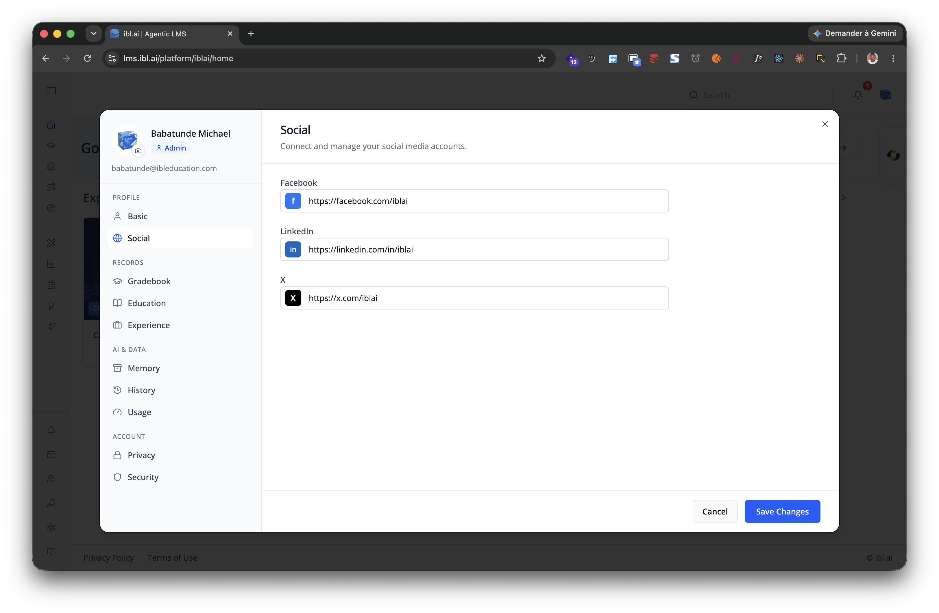
| Social | Profile | social |
Always | Social links |
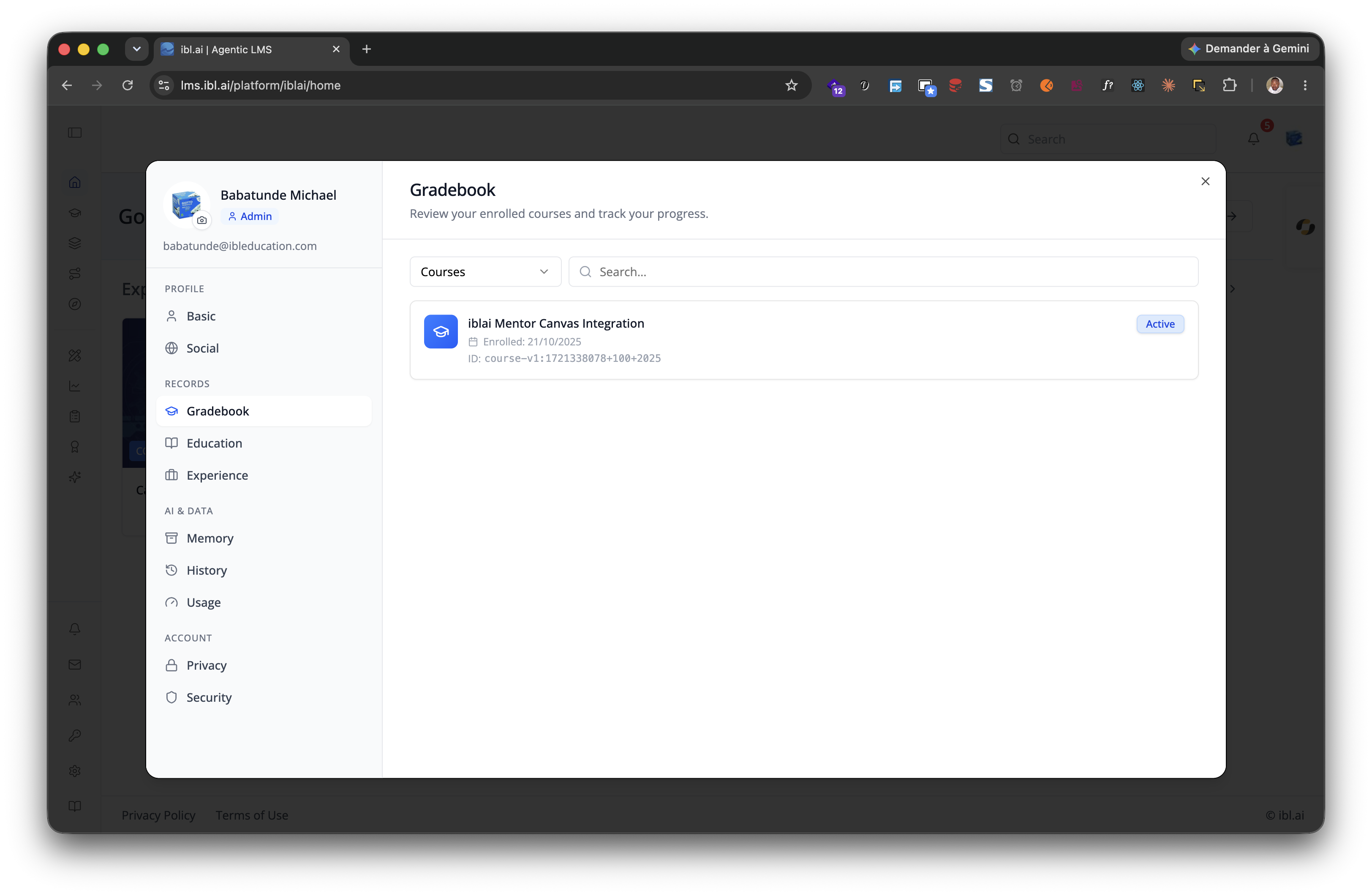
| Gradebook | Records | gradebook |
customization.showGradebookTab |
Credentials + skills gradebook |
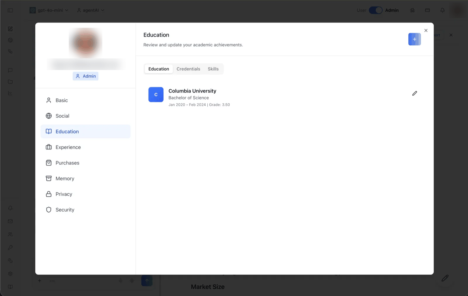
| Education | Records | education |
Always | Sub-tabs: Education / Credentials / Skills |
| Experience | Records | experience |
Always | Sub-tabs: Experience / Resume |
| Purchases | Records | purchases |
Organization has monetization enabled | Purchase history |
| Memory | AI & data | memory |
enableMemoryTab prop AND organization memsearch on |
The user's own global memories + capture/personalization toggles (the admin view of the same data is /iblai-vibe-memory) |
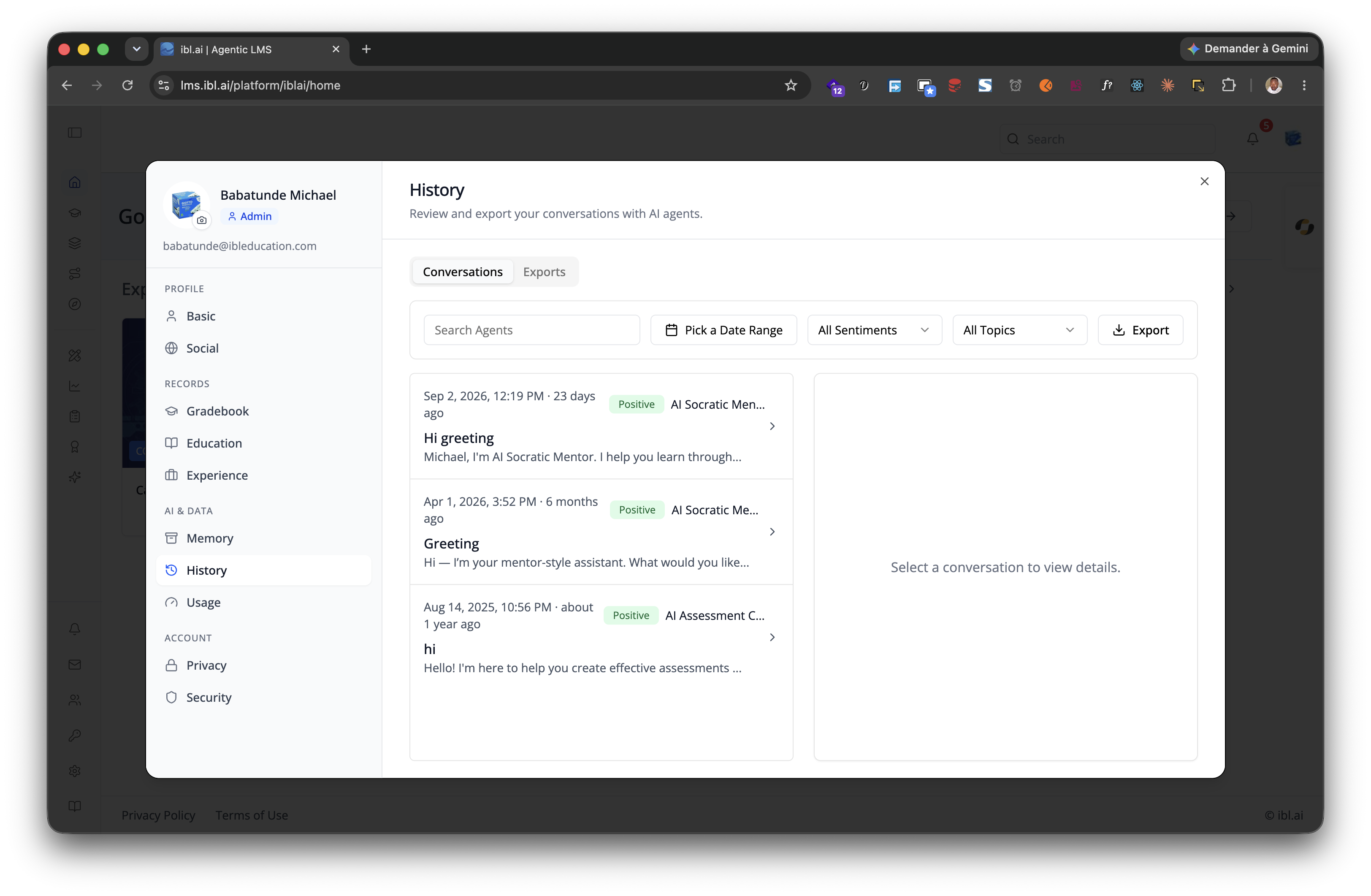
| History | AI & data | chatHistory |
Own profile, or a viewer who may read this user's chats (admin / watcher) | Conversations + Exports — documented in /iblai-vibe-history |
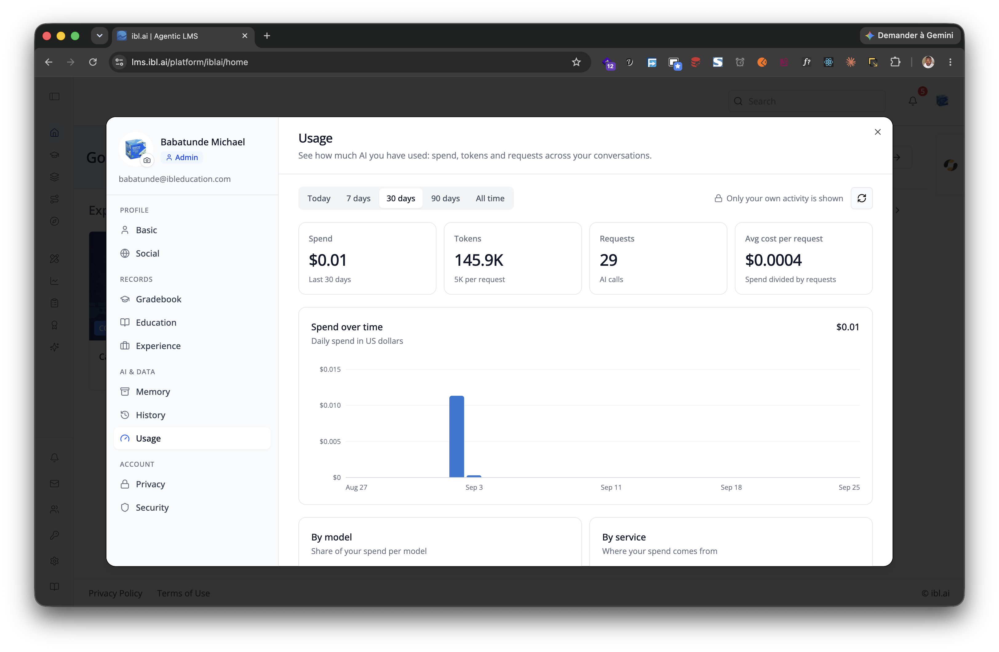
| Usage | AI & data | llmUsage |
showLlmUsageTab (default on) and the viewer is not a pure watcher |
The viewed user's AI spend, tokens and requests — see below |
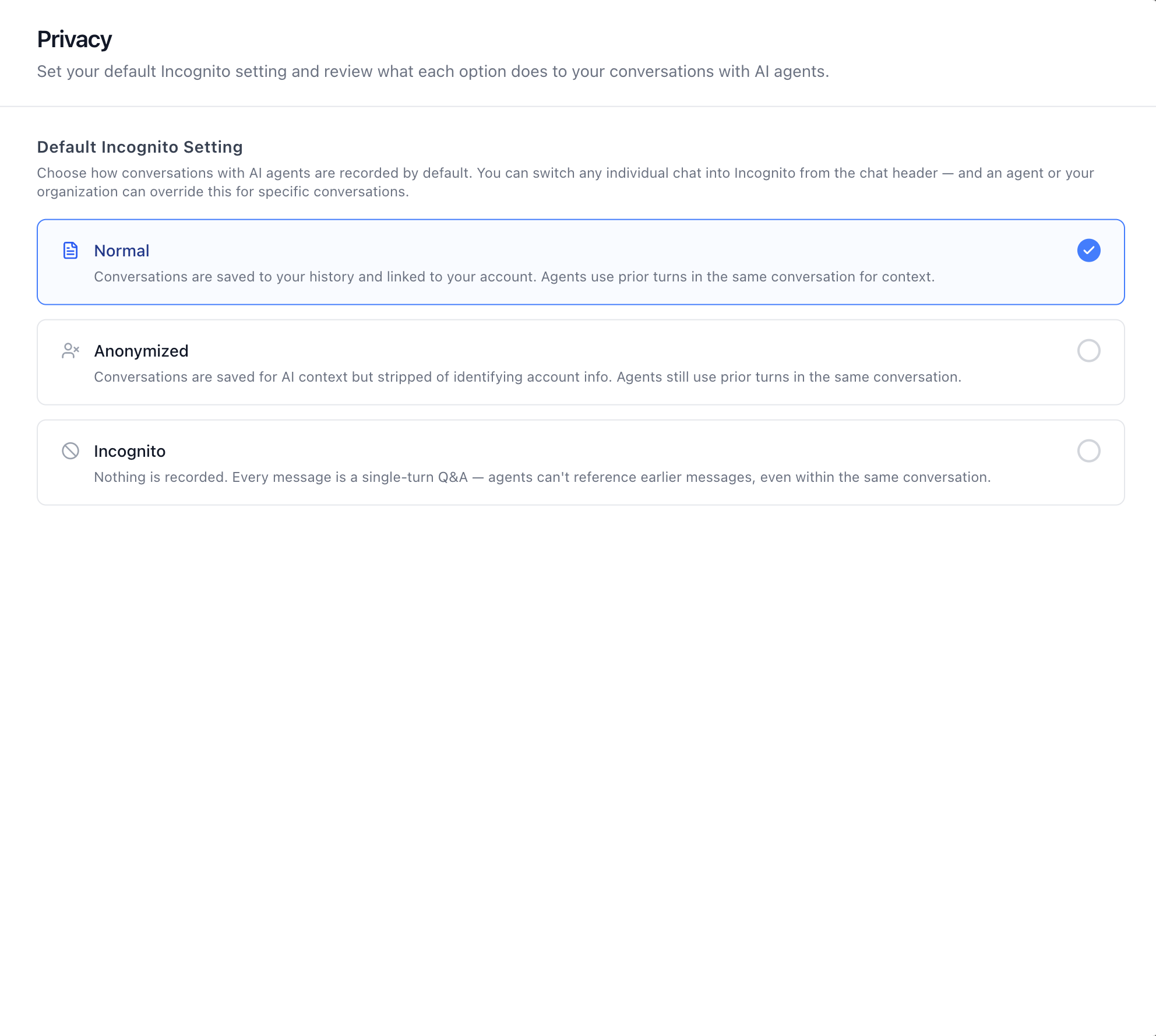
| Privacy | Account | privacy |
Organization allows user chat-privacy control | Default Incognito Setting — Normal / Anonymized / Incognito for every conversation; the whole feature is /iblai-vibe-incognito |
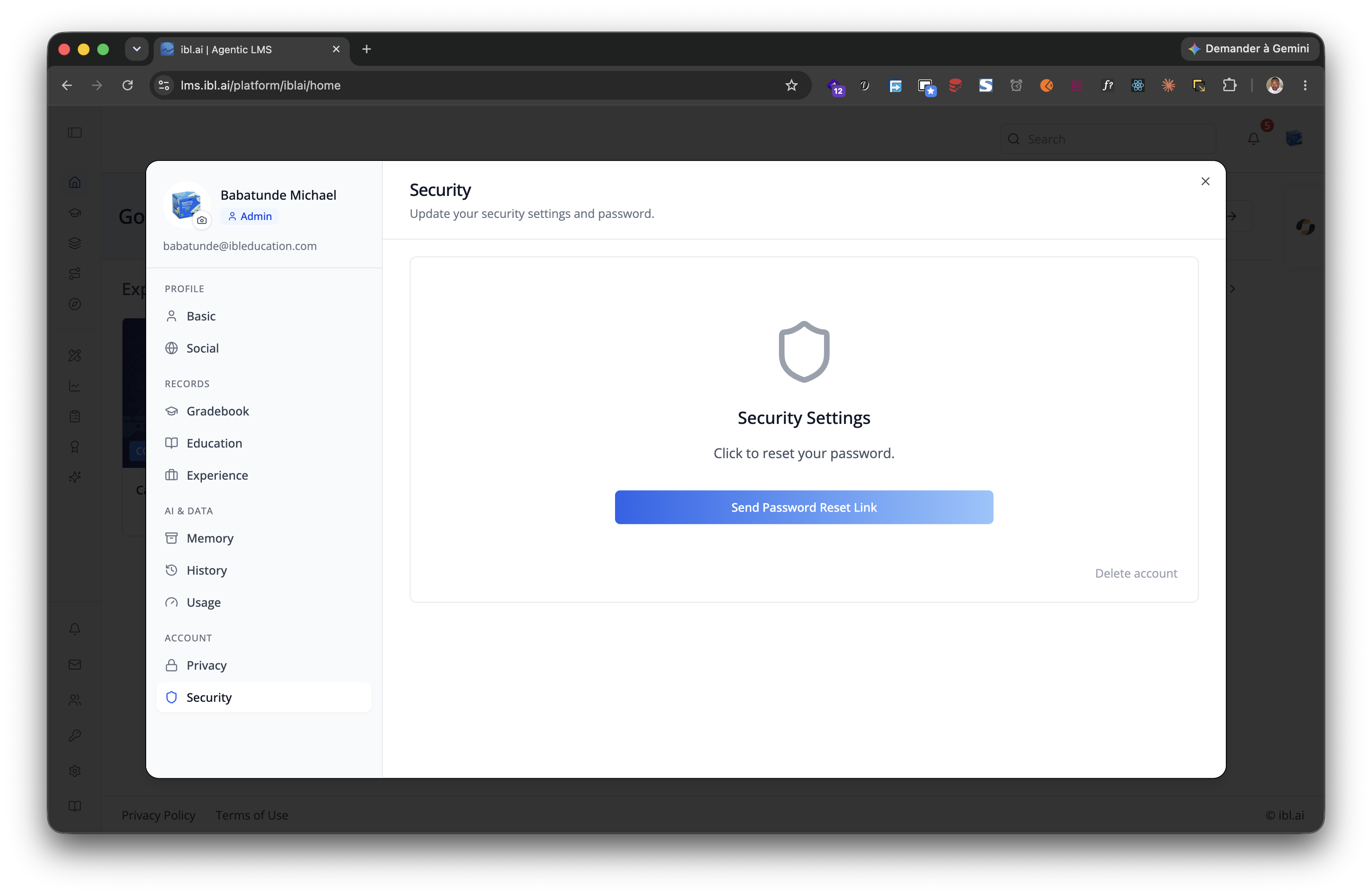
| Security | Account | security |
Own profile only | Password reset, account deletion |
| Advanced | Account | advanced |
Tauri desktop with localLLMProps.isAvailable |
Local LLM models — see /iblai-vibe-local-llm |
Tab shots: Basic · Social · Gradebook · Education · Experience · Resume · Purchases · Memory · History · Usage · Privacy · Security
Usage tab (AI spend)

What one person's AI has cost, in the profile itself — no analytics page, no admin rights needed to look at your own:
| Piece | What it shows |
|---|---|
| Range control | Today / 7 days / 30 days / 90 days / All time, plus a refresh button |
| KPI tiles | Spend, Tokens (with tokens per request), Requests, Avg cost per request |
| Spend over time | Column chart, bucketed by day / week / month depending on the range, gap-filled so empty days still read as zero; arrow keys read each bar out loud |
| By model / By service | Share of spend per model and per service, long tails folded into "Other" |
| Recent activity | The latest traces, newest first, 10 per page; expand a row to see its steps (model, input/output/total tokens, cost, latency) |
It always follows the profile on screen. The tab sends the viewed user's
username on every request, so opening someone else's profile shows their
usage, not the organization's total and not yours. The header says whose it
is ("Usage for ashlynn12" when previewing, "Only your own activity is
shown" on your own profile).
Who may see it:
- Anyone may open the tab for themselves.
- Admins and other privileged viewers see it on the profiles they preview; the backend decides and answers 403 when the viewer may not, which the tab renders as "Usage isn't available" rather than an empty chart.
- Pure watchers (the
/watchedgroups/#listpermission without being an organization admin) never get the tab at all — cost reporting excludes them, the same way the analytics tabs do. - Hosts that do not want it anywhere pass
showLlmUsageTab={false}.
Empty periods get an empty state with "Show last 90 days" / "Show all time" shortcuts; an unreachable tracing backend gets "temporarily unavailable" with a retry, an expired session gets "Sign in again".
Platform data
GET {dm_url}/api/analytics/llm-usage/ with username={user} — metrics
for the tiles, chart and breakdowns, traces for recent activity,
observations for the steps under a row. The endpoints, the per-user hooks
that wrap them (useUserLlmUsageSummary and friends) and the error contract
are in references/profile-api.md;
the REST twin is
/iblai-api-analytics
and the organization-wide view of the same data is
/iblai-vibe-analytics.
Profile Content API, User Metadata, Memory, Privacy, MediaBox, Career tabs
Everything behind the tabs — the service layer, the RTK Query hooks, the career/resume backend contract, MediaBox, and the standalone ResumeTab / EducationTab / ExperienceTab — is in references/profile-api.md. Per-user custom data is /iblai-vibe-user-metadata; memory is /iblai-vibe-memory-guide; REST: iblai-api-profile.
<UserProfileDropdown> Props
The generated dropdown component. Import from @iblai/iblai-js/web-containers/next.
| Prop | Type | Description |
|---|---|---|
email |
string |
Required. User email (from userData.user_email); used for the Gravatar avatar fallback |
username |
string |
Username — use user_nicename (the avatar metadata fetch keys on it) |
mainPlatformKey |
string |
Required. Main/community org key (config.mainTenantKey()) |
tenantKey |
string |
Active org key |
currentTenant |
Tenant? |
Full active-tenant object (from current_tenant) — labels the organization switcher |
userTenants |
Tenant[] |
Required for the organization switcher -- the full tenants list from localStorage |
userIsAdmin |
boolean |
Shows admin badge + gates the organization switcher |
userIsStudent |
boolean? |
Non-admin flag (!isAdmin) |
enableGravatarOnProfilePic |
boolean? |
Gravatar fallback when the user has no uploaded image (default true) |
showProfileTab |
boolean |
Show profile link |
showAccountTab |
boolean |
Show the dedicated "Account" item (keep false — account lives on /account) |
showTenantSwitcher |
boolean |
Show organization switcher (needs userTenants + currentTenant); gate on userIsAdmin |
showLogoutButton |
boolean |
Show logout button |
showHelpLink |
boolean |
Show help link |
showLearnerModeSwitch |
boolean? |
Show learner/instructor mode toggle (admins) |
currentSPA |
string? |
Current app id (e.g. "mentor") — used for conditional SDK rendering |
currentPlatformBaseDomain |
string? |
Base domain for custom-domain settings (config.platformBaseDomain()) |
authURL |
string |
Auth service URL |
onLogout |
() => void |
Logout callback |
onTenantChange |
(tenant: string) => void |
Called when user switches organization -- must set app_tenant in localStorage |
onTenantUpdate |
(tenant: Tenant) => void |
Called when organization data updates -- must set app_tenant in localStorage |
className |
string? |
Additional CSS class |
dropdownClassName |
string? |
CSS class for dropdown panel |
avatarSize |
number? |
Avatar size in pixels |
metadata |
{ help_center_url?: string; show_help?: boolean } |
Platform metadata for help link |
metadataLoaded |
boolean? |
Whether metadata has finished loading |
enableMemoryTab |
boolean? |
Show AI memory management tab |
enableCatalogInvite |
boolean? |
Enable catalog invite feature |
enableRbac |
boolean? |
Enable RBAC permission checks |
isModalOpen |
boolean? |
Control profile modal open state externally |
onModalOpenChange |
(open: boolean) => void |
Callback when modal open state changes |
defaultActiveTab |
string? |
Default tab when profile modal opens — any id from the Profile tabs table, e.g. llmUsage |
onAccountDeleted |
() => void |
Callback after account deletion |
<Profile> Props (Full-Page Profile)
Import from @iblai/iblai-js/web-containers.
| Prop | Type | Description |
|---|---|---|
tenant |
string |
Org key |
username |
string |
Username |
isAdmin |
boolean |
Admin flag |
onClose |
() => void |
Close callback |
customization |
object |
See below |
targetTab |
string |
Initial tab id — see the Profile tabs table (basic, social, gradebook, education, experience, purchases, memory, chatHistory, llmUsage, privacy, security, advanced) |
enableMemoryTab |
boolean? |
Show the Memory tab (still requires organization memsearch to be on) |
showLlmUsageTab |
boolean? |
Show the Usage tab — defaults to true; pure watchers never see it either way |
localLLMProps |
object? |
Props for local LLM tab (Tauri desktop only) |
currentSPA |
string? |
Current app id (e.g. "mentor") — used for conditional SDK rendering |
onAccountDeleted |
() => void |
Callback after account deletion |
Customization object
{
  showMentorAIDisplayCheckbox?: boolean;  // Show the "Display Agent Sidebar" switch
  showUsernameField?: boolean;  // Show username field (read-only)
  showPlatformName?: boolean;  // Show platform/tenant name badge
  useGravatarPicFallback?: boolean;  // Use Gravatar when no profile pic
  showGradebookTab?: boolean;  // Show the Gradebook tab
  showLeaderboardDisplayCheckbox?: boolean;  // @deprecated — ignored, see below
}
The Basic tab's switches sit in a section called Features. It holds one
switch, Display Agent Sidebar (showMentorAIDisplayCheckbox), with an
info icon explaining what it turns on: "Keeps the AI agent panel beside
whatever you are working on, so you can ask questions without leaving the
page." The old Display Leaderboard switch was removed —
showLeaderboardDisplayCheckbox still type-checks so existing callers keep
compiling, but it renders nothing.
<UserProfileModal> Props (Profile + Account Modal)
For a profile editing modal (used by the MentorAI reference app), import
UserProfileModal from @iblai/iblai-js/web-containers/next. This is a
dialog that combines profile editing and account settings in one overlay.
targetTab alone decides which half renders: the Profile ids
(basic, social, education, experience, resume, memory,
chatHistory, llmUsage, security, advanced) open the profile, the
Account ids (organization, management, integrations, billing,
monetization, datasets) open organization settings. Billing/purchases is
on the Account side, not the Profile side.
Required
| Prop | Type | Description |
|---|---|---|
isOpen |
boolean |
Whether the modal is visible |
onClose |
() => void |
Close callback |
params |
{ tenantKey: string; mentorId?: string; isAdmin?: boolean } |
Organization key, optional agent ID and admin flag |
authURL |
string |
Auth service URL (from config.authUrl()) |
Optional
| Prop | Type | Description |
|---|---|---|
tenants |
Tenant[] |
The user's full tenants list from localStorage |
targetTab |
string |
Initial tab — any id from the two lists above (default basic) |
showLlmUsageTab |
boolean |
Show the profile's Usage tab (default true) |
enableMemoryTab |
boolean |
Show the profile's Memory tab (needs organization memsearch) |
showGradebookTab |
boolean |
Show the profile's Gradebook tab |
showBenchmarks |
boolean |
Show the Account side's Benchmarks tab (default false; each app opts in) |
showMentorAIDisplayCheckbox |
boolean |
Show the Basic tab's Display Agent Sidebar switch |
showPlatformName |
boolean |
Show organization name badge |
useGravatarPicFallback |
boolean |
Use Gravatar when no profile pic |
currentSPA |
string |
Current app identifier (e.g., "agent") |
currentPlatformBaseDomain |
string |
Base domain for custom domain settings |
currentPlan |
string |
Current plan name, shown by the Billing tab (which appears when the organization's paywall is on — there is no billingURL prop) |
onTenantUpdate |
(tenant: Tenant) => void |
Called when organization is updated |
onBillingTabRequest |
() => Promise<void> | void |
Called when billing tab is opened -- fetch billing data |
onUpgradeClick |
() => void |
Called when upgrade button is clicked |
onAccountDeleted |
() => void |
Called after account deletion |
Step 6: Verify
Run /iblai-vibe-ops-test before telling the user the work is ready:
pnpm build-- must pass with zero errorspnpm test-- vitest must pass- Start dev server and touch test:
pnpm dev & npx playwright screenshot http://localhost:3000/profile /tmp/profile.png - In the browser, click every tab the sidebar lists — none may 404 or come
up blank. On Usage, switch the range and watch the numbers change;
$0.00across every range means the account genuinely has no traced AI calls, while an error card means the request failed (check the browser console for the status).
Important Notes
- Redux store: Must include
mentorReducerandmentorMiddleware initializeDataLayer(): 5 args (v1.2+)@reduxjs/toolkit: Deduplicated via webpack aliases innext.config.ts- Admin detection: Derived from
tenantsarray in localStorage - SDK hardcoded styles: The SDK Profile component uses
bg-whiteandbg-gray-50internally. Do NOT override these. Instead, wrap the component in a white container so it renders correctly against the gray page background. - Billing vs Purchases: Organization billing (plan, credits, spend limits)
lives on the Account page (
/iblai-vibe-account,/iblai-vibe-billing). The Profile page's own Purchases tab shows the user's purchase history and only appears when the organization has monetization enabled. - Feature-gated tabs: Memory, Privacy, Purchases, Gradebook, Usage and
Advanced only render when their gate is on (see the Profile tabs
table) —
ProfiletakestargetTabat its word and renders an empty panel for a hidden tab (Accountis the one that falls back to the first tab you may see), so check the gate before deep-linking. - Previewing someone else (
Profilefor a username that is not the signed-in user) drops Security and turns the copy neutral — "Spend, tokens and requests across conversations" instead of "your". History and Usage stay, gated on what the viewer may read. - Brand guidelines: BRAND.md